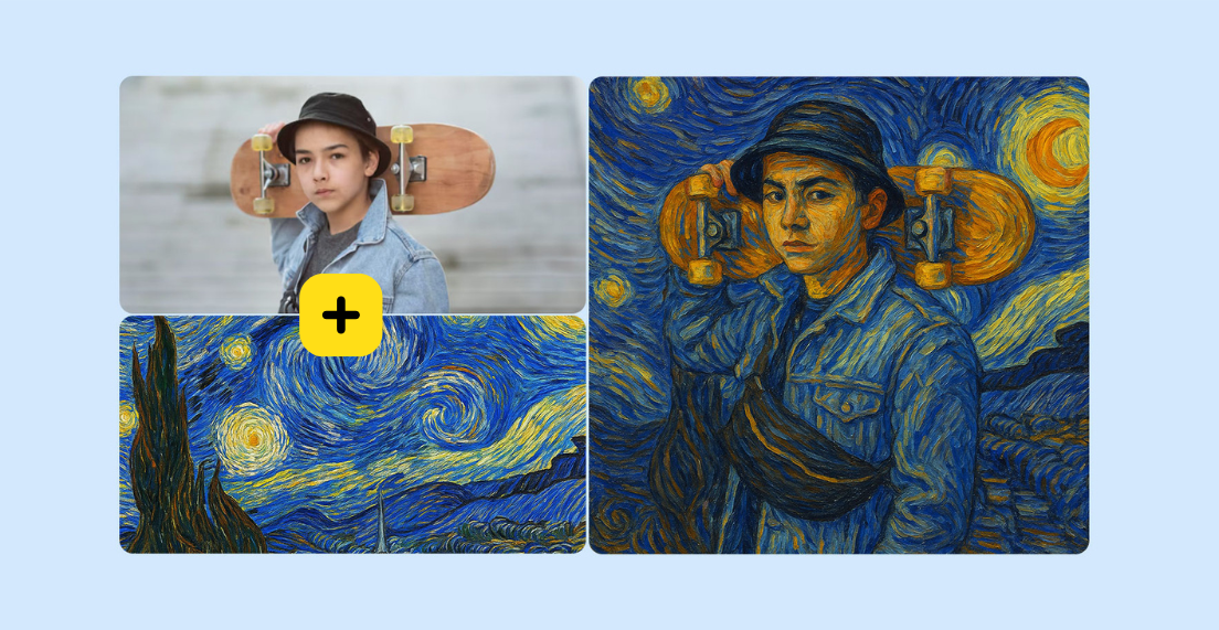
Lots of users asked for break their logo name into 2 lines to save space or add more versatile to their logo design. To respond to our users' needs, we are excited to introduce our latest new feature: the 2 Line/Stacked Logo Name Design! With this new feature, your logo name can easily adapt to different layout.
Time to try out this feature to design your new logo more versatile and flexible! Today, i am going to show you how, let's get started!
Split Logo Name Into 2 Parts
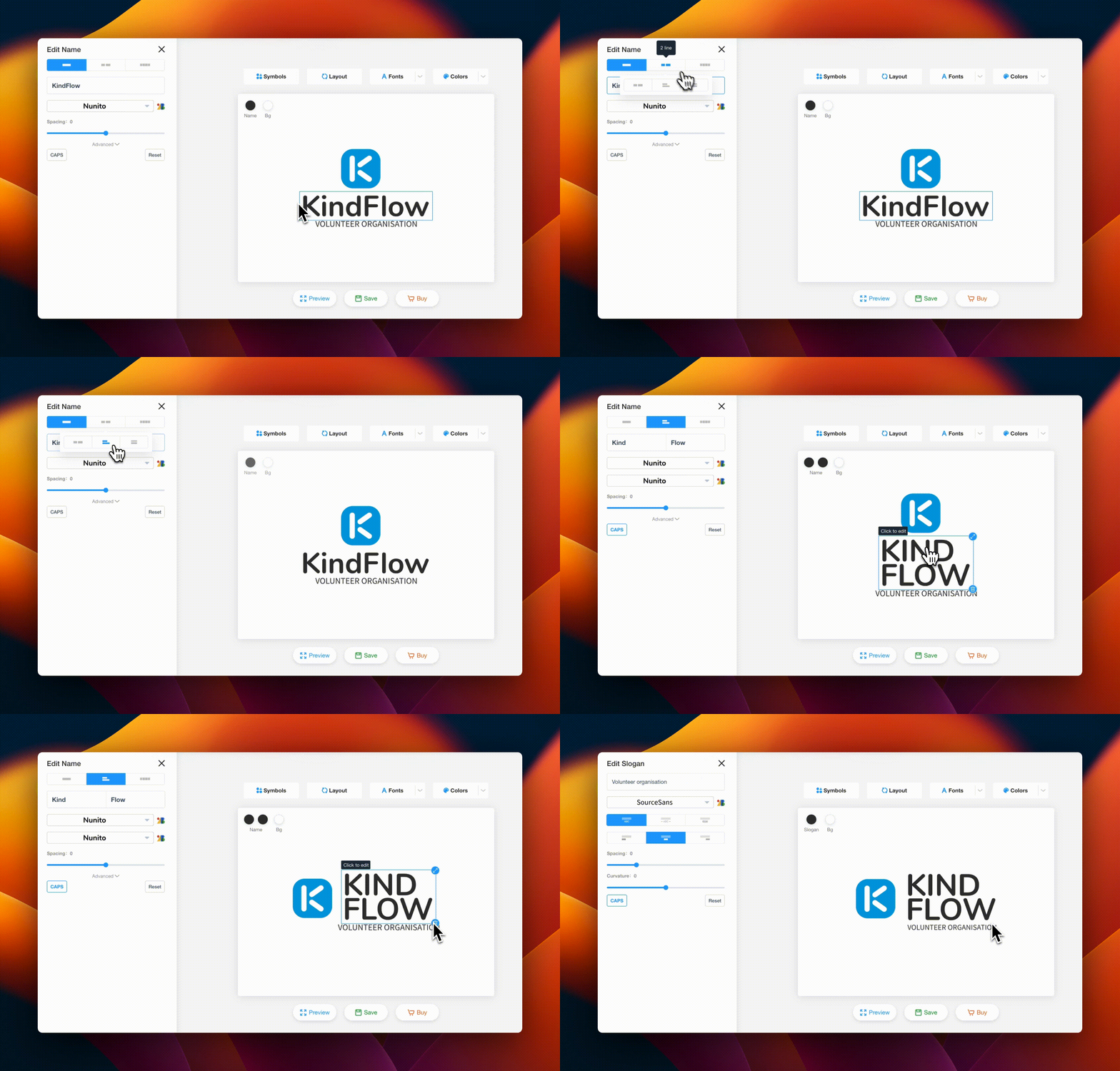
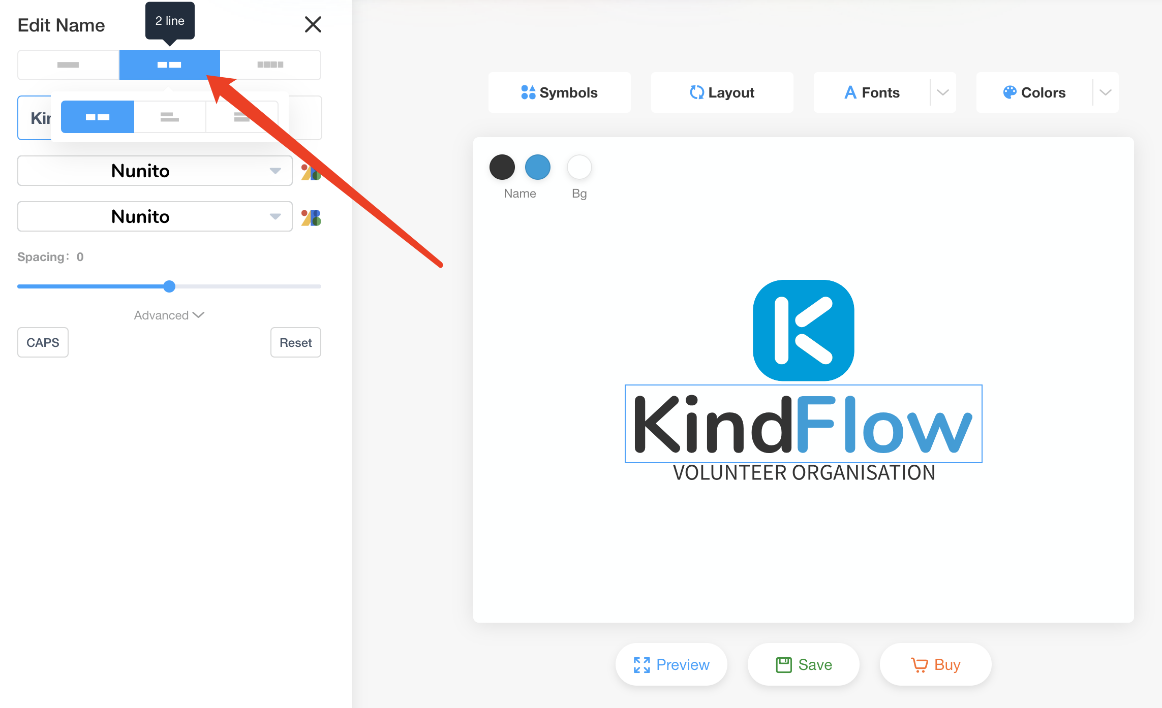
In your logo editor, click on your logo name then move to top left of your editor click on "Two parts" to separate your logo name into two distinct parts. Our editor will automatically split your logo name into 2 parts. If the logo name is separated in the wrong place, you can always adjust it yourself manually.
Choose The Right Layout For Your Logo Name
After you split your logo name into 2 lines, you will be able to choose from one of three logo name layout options. Here, you can choose between "default" "stacked," or "justified" layouts for your logo name. Then reposition the logo name around the symbol and adjust the entire logo design layout as your desire.
Make your own logo in seconds!
Try It NowMake your own logo in seconds!
Try It NowApply Different Font And Colors
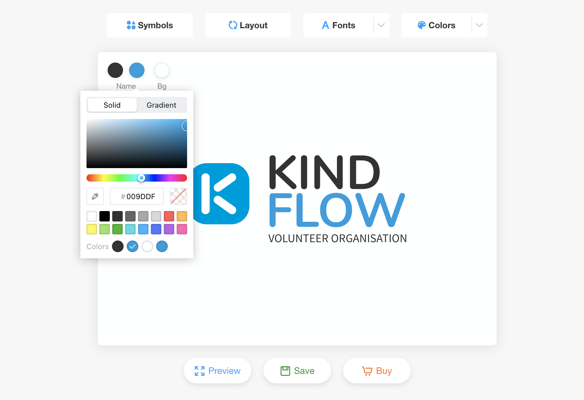
Once you are satisfied with your logo layout, last step is to apply different fonts and colors to your logo to align with your brand visual identity. In this case, i will change the logo name "FLOW" into the same blue color as the "k" letter monogram to keep brand consistency. In today's digital age, adding gradient color to your logo can be another trendy and good choice for your next new logo design.
 👆 Click to create a similar logo
Tips and Logo Templates for 2 line/Stacked Logo Design.
Here are some additional tips for creating an effective 2 line/stacked logo design: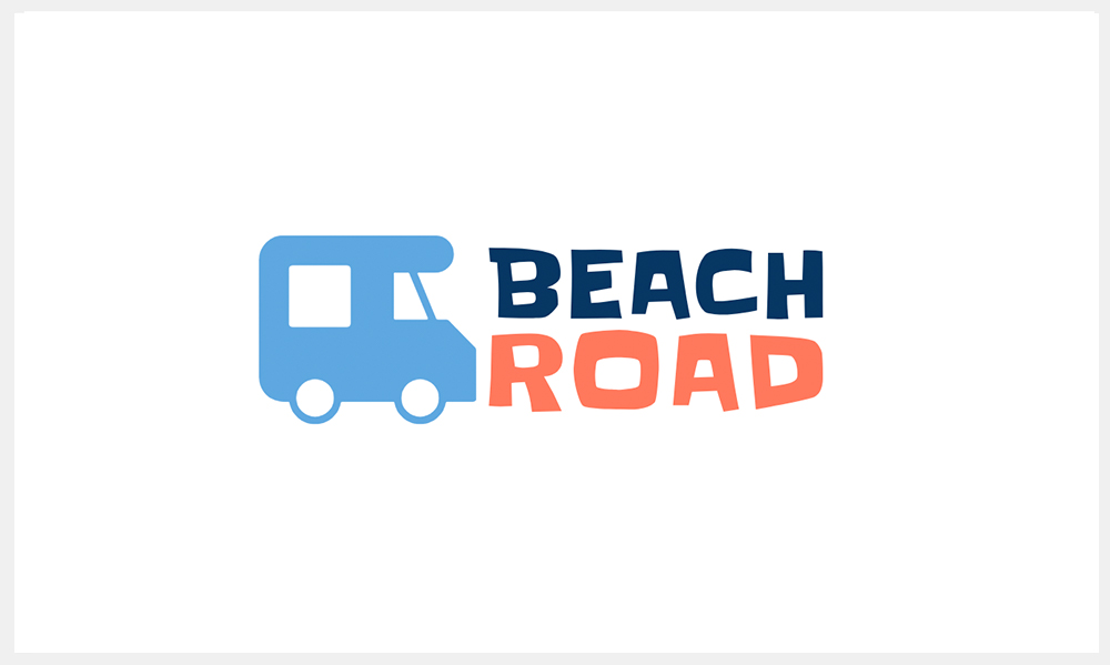 👆Click to create a similar logo.
💡Making Sure Your Font Style Is Align With Your Logo Icon.
The Beach Road logo name choose very cute and fun cute font style, stacked together to avoid the logo name become overly long. Also this cute font style perfectly align with the adorable logo icon to bring out this very cute and cheerful brand personality.
 👆Click to create a similar logo.
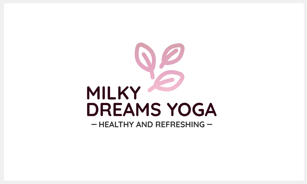
💡Creatively Position Your logo Icon With Stacked Logo Name.
Play with your stacked logo with your logo icon position to see if there any creative way to come up with creative position to make your logo stand out. Inspired by examples like this yoga logo.
 👆Click to create a similar logo.
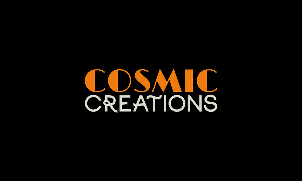
💡Crafting a Distinctive Logo with Creative Font Pair
Using a unique and special font in logo design can be a bold and effective choice. In many cases, when your font is exceptionally distinctive, it can convey your brand's personality and identity all on its own, eliminating the need for an accompanying icon or symbol. You can click on the Font button above and choose "Font Pair" to see some of our suggest font pair options or mix-and-match your own font combinations. Here are our editors' pick of top 10 logo fonts for your next logo design, check them out!
Conclusion
Now that we've walked you through the exciting world of stacked logos, it's time for you to make a logo for your brand! So, go ahead and put your newfound knowledge to the test! Don't be afraid to try out various suggest new layouts and colors until you find the one that works best for your brand.

