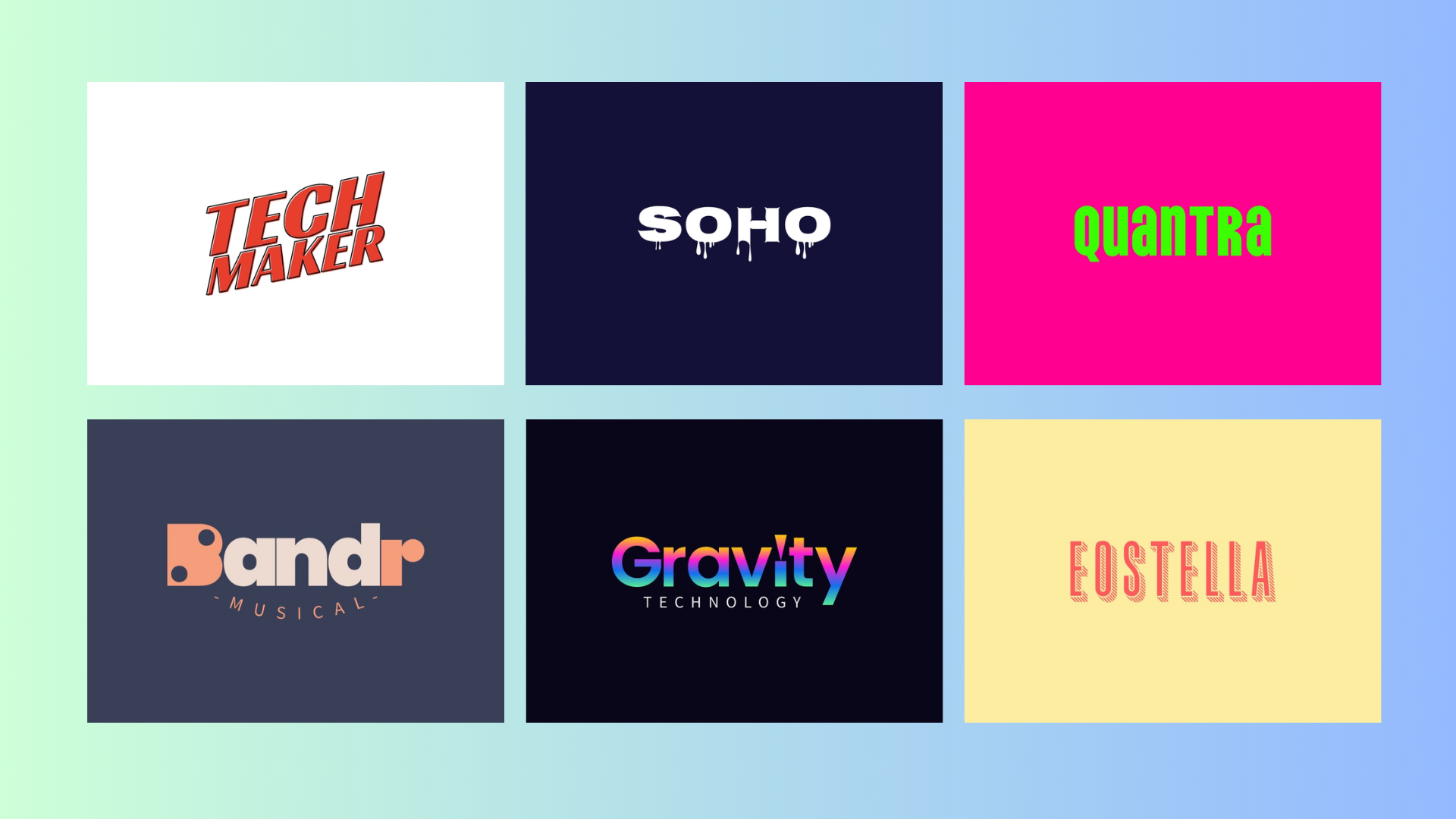
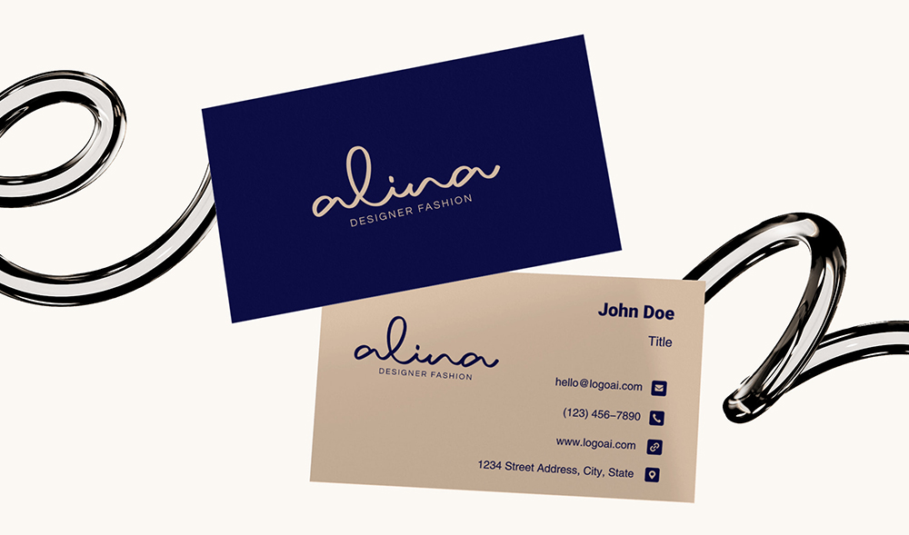
Text based logos stand out as efficient and bold statements, with clean typography and minimal embellishments. It can communicate the brand’s name and essence with no distractions, and focuses your attention on the brand itself. Some of the most influential companies across different fields utilize simple text-based designs, such as Google, Calvin Klein, Forbes, etc.

For those who are creating or refreshing their logos, simple text-based logos can be a great choice. It can reinforce brand recognition, ensuring that the name remains at the forefront of your audience’s mind. Plus, its simplicity makes them super versatile and adaptable from email signatures, t-shirts, billboards, to business cards. Simple text-based logos are also comparatively flexible in adaptation to different colors and backgrounds.Overall, text logos' minimalist approach can provide you with both elegance and functionality, and sets them as favorites for industry leaders.
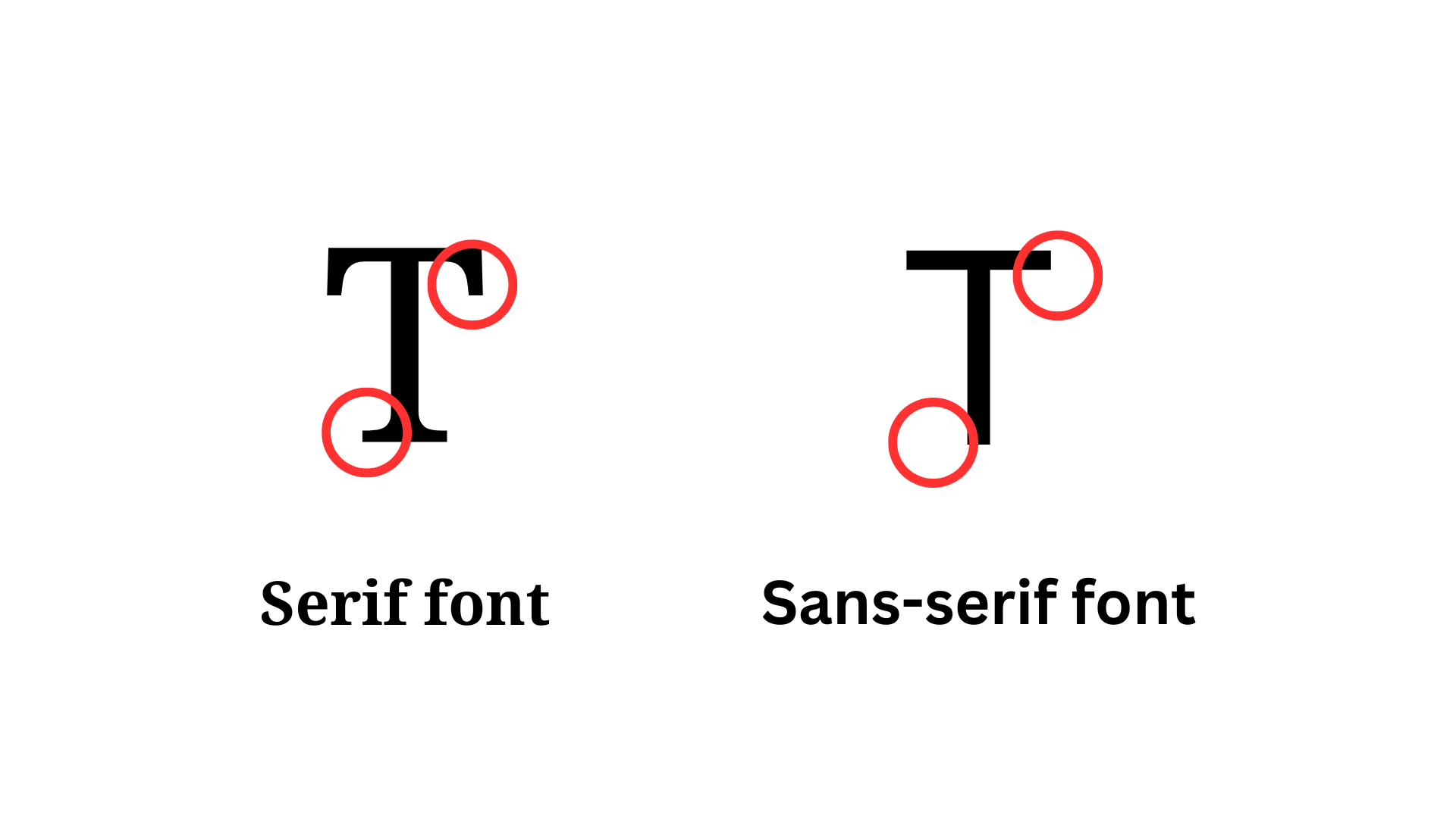
Generally, text based logos use one of two font types - serif and sans-serif. Serif refers to the protruding edges on the ends of each letter stroke. Sans-serif refers to fonts that lack (sans) that line. Serif fonts are more traditional, utilized in print media and official printed documents and carry an air of authority. Meanwhile, sans-serif fonts are considered to be more "modern" and sleek, oftentimes utilized for online content. However, there are no hard rules about which style should be used for which applications. Depending on your brand personality, the message you are trying to convey, and space constraints, you may opt for different styles that best fit your needs.
Here are 5 logo designs that can help you design your very own simple text-based logo:
1. Pastel contrasting text with 3D effect
 👆Click to create logo using the Eostella template
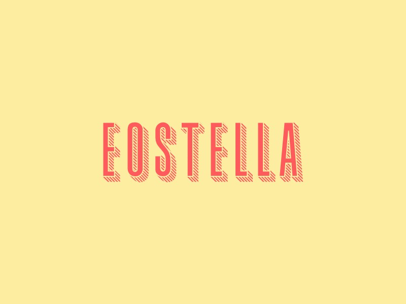
The Eostella logo features bold uppercase typography in a vibrant coral shade on a light yellow background, the contrast immediately drawing attention. The vibrant colors invoke warmth while still maintaining a clean, approachable aesthetic. An incorporation of diagonal textured shading adds a unique touch of dimension and form. The Eostella logo design showcases how minimalist text can be combined with subtle artistic flair to create an amazing logo.
2.Monochrome text-based logo utilizing shapes
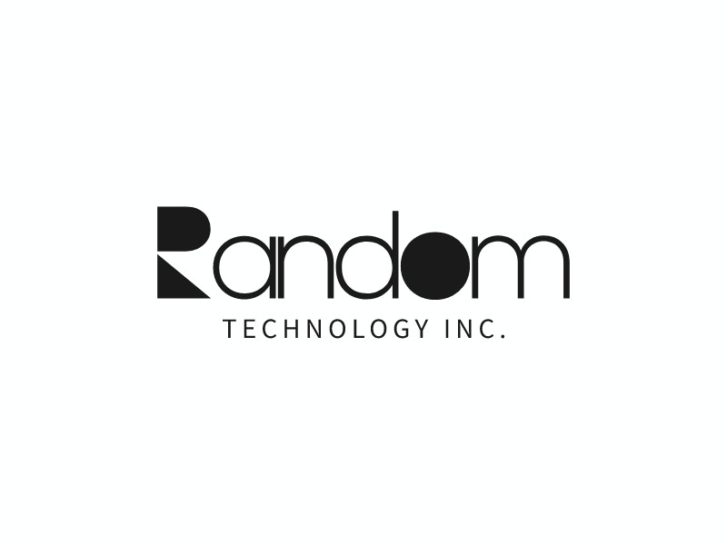 👆Click to create logo using the Random Technology Inc. template
We can also utilize mutation of the text into shapes to draw attention to the logo.The uppercase R is broken into a semicircle and triangle, abstractifying its form while still maintaining the logo's overall readability. This subtle transformation blurs the lines between typography and graphic design. Not only does it enhance the visual appeal, but also makes it stand out among other text logos that only utilize traditional text.
3.Playing with colors in text
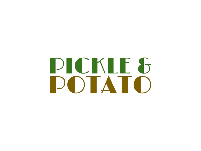 👆Click to create logo using the Pickle & Potato templatePickles and Potato utilizes a clever color change to represent the subject. The word 'Pickle' is brought to life with a vibrant green, evoking the image of a fresh, tangy pickle. Meanwhile, 'Potato' is grounded in a warm, earthy brown, representing the hearty appeal of a potato. This use of color transforms the text into imagery that the viewer’s imagination can easily connect to. You can use colors in your own logo to communicate brand themes or details, working as a cheeky substitute for traditional icons.
Make your own logo in seconds!
Try It NowMake your own logo in seconds!
Try It Now4. Simple text based logo with bold lines
 👆Click to create logo using the Cleveland Yimby template
The Cleveland Yimby logo uses black horizontal lines that forces the viewer’s eye to look at the center. Thick sans-serif font displays the brand name. This bold and modern design evokes a sense of confidence; its italicization mimics forward momentum.While Yimby is in smaller font at the bottom, its cutout and spacing still ensures readability and sleekness. Logos of this style are often seen in sports brands and arenas, due to their portrayal of modernity and dynamicism.
5. Changing up the alignment
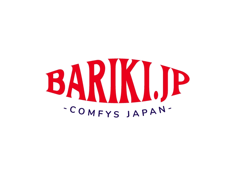 👆Click to create logo using the Bariki.jp template
Rather than overrelying on commonplace horizontal alignment, you may also change things up by applying an angle out bulge on your text.The bold red serif font combined with the stretched letters give it movement, playfulness, and makes it visually striking. The bottom navy-blue motto (while not as bold) also follows the same curve, creating cohesiveness between the two lines of text.
Wrap Up
In conclusion, simple text-based logos have a timeless charm that combines minimalism with flexibility, making them a powerful choice for brands across all industries. By focusing solely on the brand’s name and message, these logos cut through the clutter and avoid unnecessary complexity. Thoughtful typography, spacing, and subtle touches often reinforce the brand’s identity. Their simplicity makes them easy to scale and adapt, ensuring they stand out across different platforms, from digital to print. Plus, they offer room for creativity through clever text manipulation, color choices, and alignment, helping brands express personality and emotion without relying on extra imagery. In a world full of visual noise, a well-designed text-based logo reminds us that sometimes, less really is more.
If you would like to try your hand at making your own simple-text based logos, head on over to the LogoAI AI logo generator! We also provide helpful text-based logo templates for beginners as well as a wide variety of AI assistance tools.

