
Minimalist aesthetic is popular worldwide, especially in Japan where its ideal is rooted in Zen Buddhist philosophy. This desire for "less is more" allows viewers to focus on the actual important parts.
In logo design, minimalism achieves the same effect; it directs the viewer's full attention onto the actual brand name rather than any auxiliary components. Many famous logos retain minimalism by using clean fonts, simple colors, and uncluttered layouts. This ensures that the logo maintains readibility and ensures timelessness.
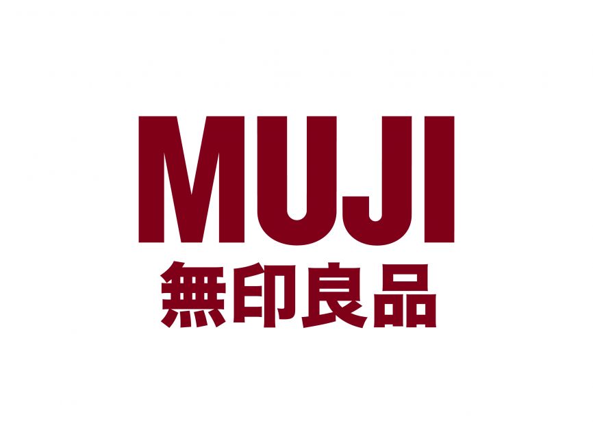
One of the most notable examples of Japanese minimalist logos would be that of MUJI, which translates literally to "No Brand".
The MUJI Logo and Brand Philosophy
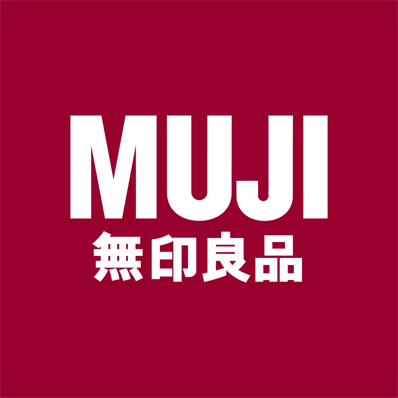
The MUJI logo features a sans-serif, bold maroon font on top of a white background. It is coupled at the bottom by the Japanese name of the band, also in a very simple and readable font. There are no additive motifs, lines, or colors. It is meant to reflect the brand's claim that without excess branding or frivolousness, they are able to provide high-quality goods.
MUJI's success in branding themselves as no-frills, quality salesmen led to huge success in the global market. In a paradoxical way, the lack of loud branding in a heavily branded world allowed MUJI to stand out among its competitors. Its minimalism became its brand.
Key Elements of Minimalist Japanese Logos
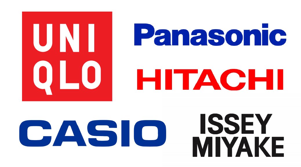
Other famous minimalist Japanese logos include CASIO and Hitachi, whose logos have remained the same since 1972 and 1992, respectively. Some key design choices are shared by these iconic logos, including the use of simple sans-serif fonts and singular primary colors. The famous UNIQLO logo uses negative space, a hallmark of Japanese design, to accentuate the brand name while keeping balance. Another key feature of minimalist Japanese logos is their adaptability. They are designed to look elegant across different mediums—whether on packaging, digital platforms, or signage—ensuring longevity without needing frequent redesigns.
Why Minimalism Works in Branding
One of the upsides of sticking with minimalistic branding is avoiding trends that may quickly become outdated. Clean lines and balanced compositions convery longetivity and reliability in not only the logo, but the brand itself. Choosing to put the brand name (and only the brand name) at the forefront reassures consumers that the brand's quality speaks for itself.
But minimalism works all over the globe, not just in Japan. These designs strip away excess details, making it easy to understand regardless of one's language or cultural background. Many Japanese, Scandinavian, and Western designs share these minimalistic influences, showing how this design approach is relevant across cultures. With the rise of digital media and the need for clarity in a fast-paced world, minimalism has only grown in popularity, becoming a timeless choice for brands that want to stand out while staying simple.
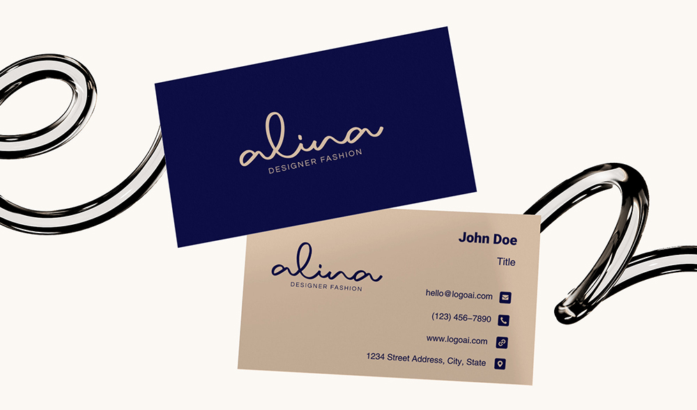
Make your own logo in seconds!
Try It NowMake your own logo in seconds!
Try It NowCreate a Minimalist Logo with LogoAI
Minimalist logos have a strong impact on branding by enhancing sophistication and recognizability. This approach aligns with global design trends, fostering a sense of elegance, reliability, and timeless appeal, making brands more adaptable and enduring in competitive markets.
If you are looking to create a sleek and professional logo that embodies these minimalist principles, check out our logo maker. In combination with AI driven designer tools, you can generate a clean, sophisticated logo that captures your personal brand. Or click on the design templates for minimalist logos below and bring your vision to life today!
 Click to create logo with the Urban template
 Click to create logo with the Pixels template
 Click to create logo with the Skindrive template