
Instagram, Tinder and Firefox all using colorful gradient as their brand logo design to create a striking visual impact. Gradients can add a special 3D effect to your logo, which can stand out from the flat designs. Play with all different angle of gradients and choose the proper color combination can create a very memorable brand identity for your business. Today we are going to show you some top gradients logo templates from LogoAI. Let's dive in!
What's Gradient Logo Design?
A gradient logo design features a graduate blend of 2 or more colors to create a sense of depth for your design. Whether it's your logo symbol, your logo text or your logo background, you can always experiment to see which way is the best to come up the final unique logo design. Choosing the right color combination is essential when it comes to gradient logo, you can try similar color hue or complete contrast colors even incorporate transparency to find the best result.
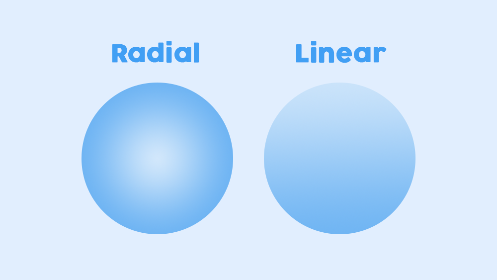
The most common type of gradient is radial and linear gradient. Radial gradient change originates from a central point and radiates outward or inward. Linear gradient where colors transition along a straight line. The direction of this line can vary; it can be horizontal, vertical or at any angle.
TOP Gradient Logo Design Templates From LogoAI
We have selected few the most visually appealing gradient logos templates for your next new logo design. Each one has its unique design approach to give you more inspiration to come up the best result.
Make your own logo in seconds!
Try It NowMake your own logo in seconds!
Try It Now1. Select a Distinctive Gradient Logo Icon
 👆Click to edit logo
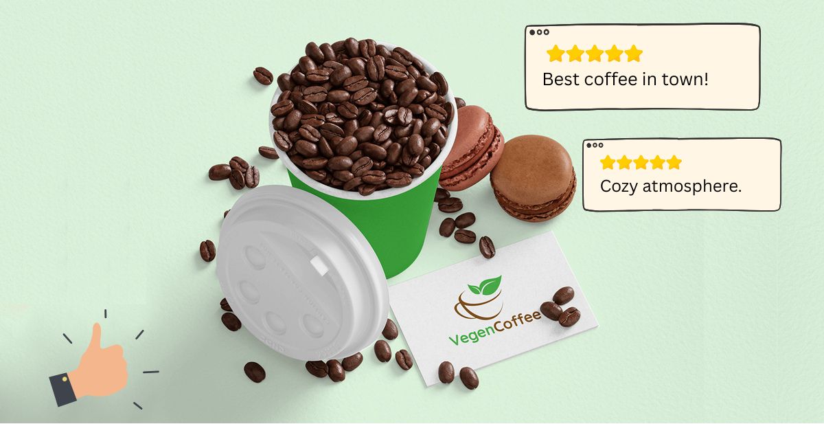
Considering carefully about your brand value and mission and choose the right color combination to design a unique gradient logo icon that can bring out your brand personality and give people a lasting impression.
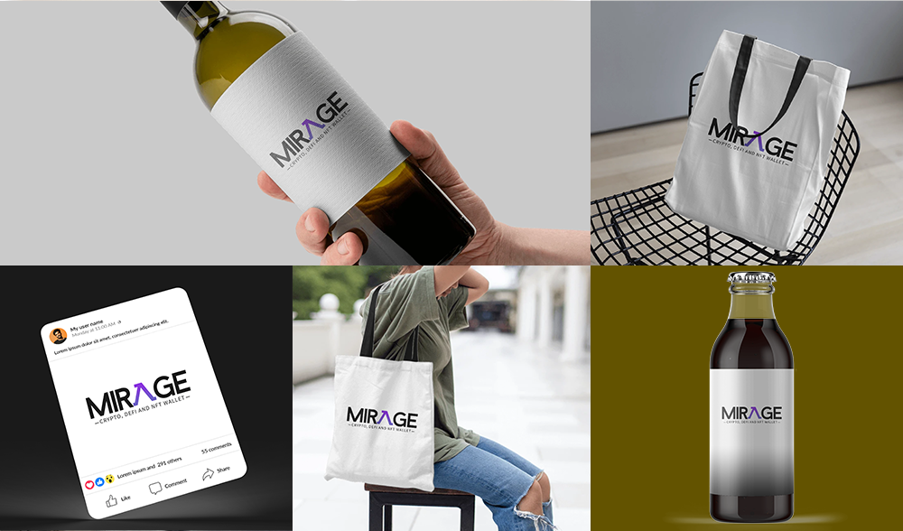
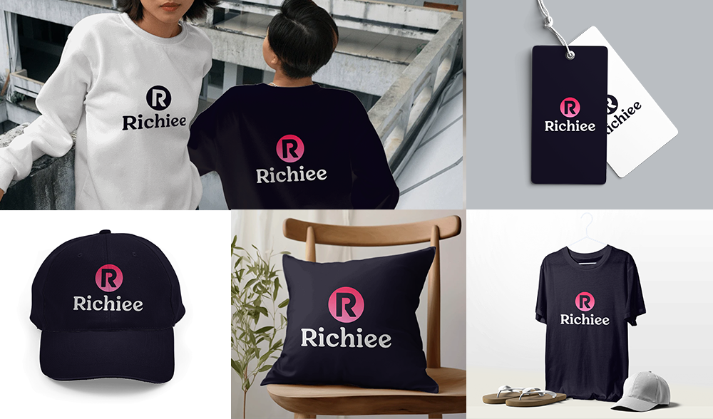
 Download logo mockups from LogoAI's Brand Center
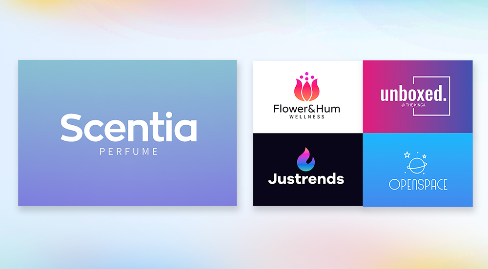
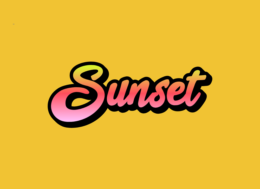
2. 3D Gradient Text Effect
 👆Click to edit logo
When it comes to text effect logo design, choosing a bold typeface and adding gradient to your logo text often create a very eye-catching logo design that stand from the crowed. Play with the text shadow and highlights to create the 3D effect. Try to avoid extreme gradient, maintaining the readability of the text the crucial for your business.
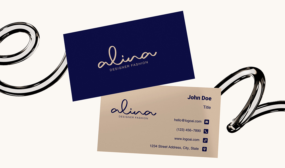
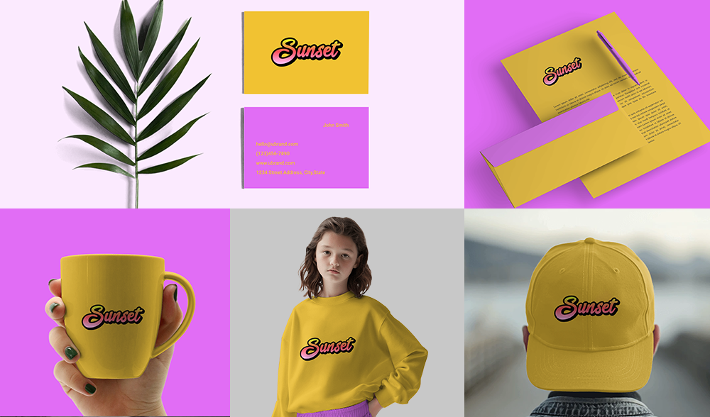 Download logo mockups from LogoAI's Brand Center
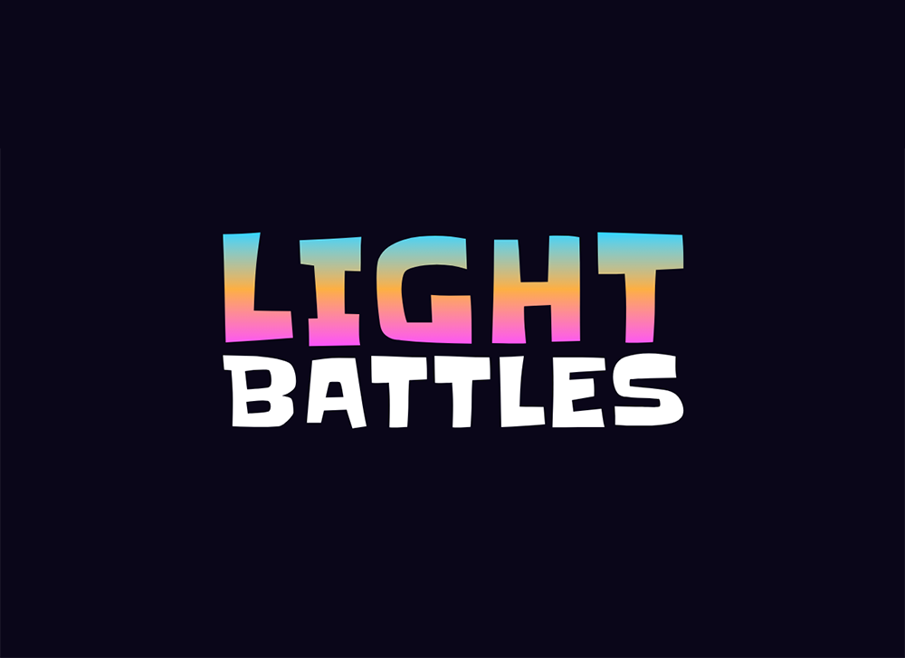
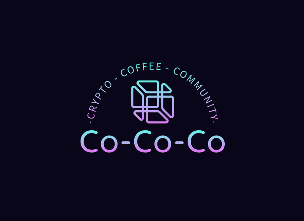
3. Using a Different Color Scheme for Stacked Logo
 👆Click to edit logo
When you have a stacked logo, you can choose different color scheme for each part to create a visual hierarchy. Different colors can emphasize particular words or letters, enabling a brand to highlight the most important aspects of their name or slogan.
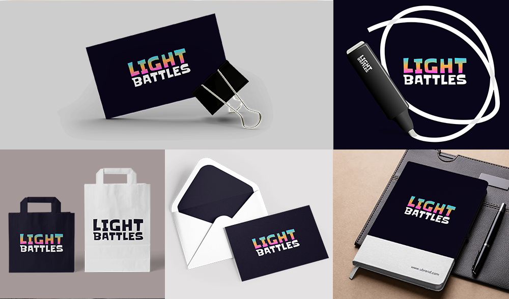 Download logo mockups from LogoAI's Brand Center
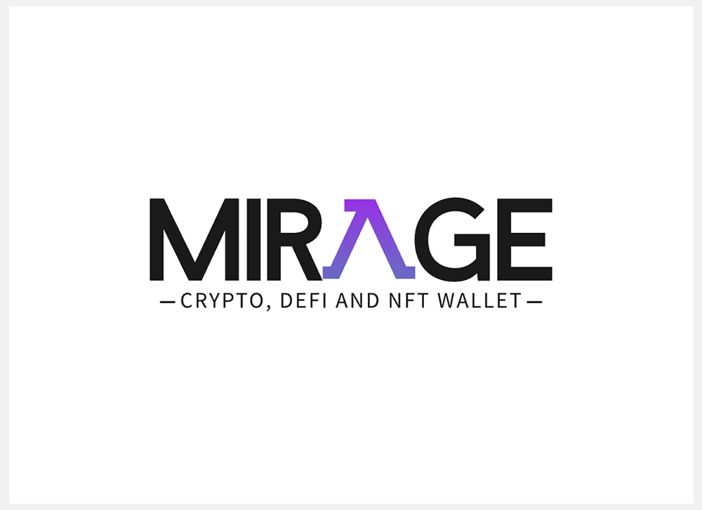
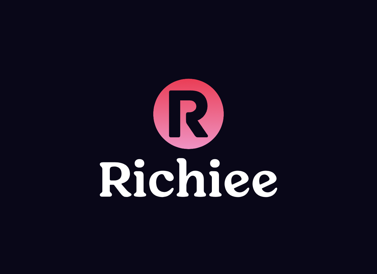
4. Highlight One Letter With Gradient Color
 👆Click to edit logo
This technique creates a focus point. By blending gradient color to a single letter, it makes the overall logo design more visually appealing and engaging. This method id effective when you need a unique but also modern style logo design.
 Download logo mockups from LogoAI's brand center
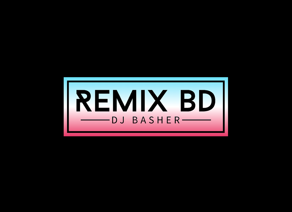
5. Gradient Badge Logo Design
 👆Click to edit logo
By combine a vibrant gradient color with a traditional badge shape as the logo background, it create a sense of bold cutting edge personality on the same time also bring trustworthy and reliable to the brand. It's a perfect choice when you want to incorporate both quality into your brand.
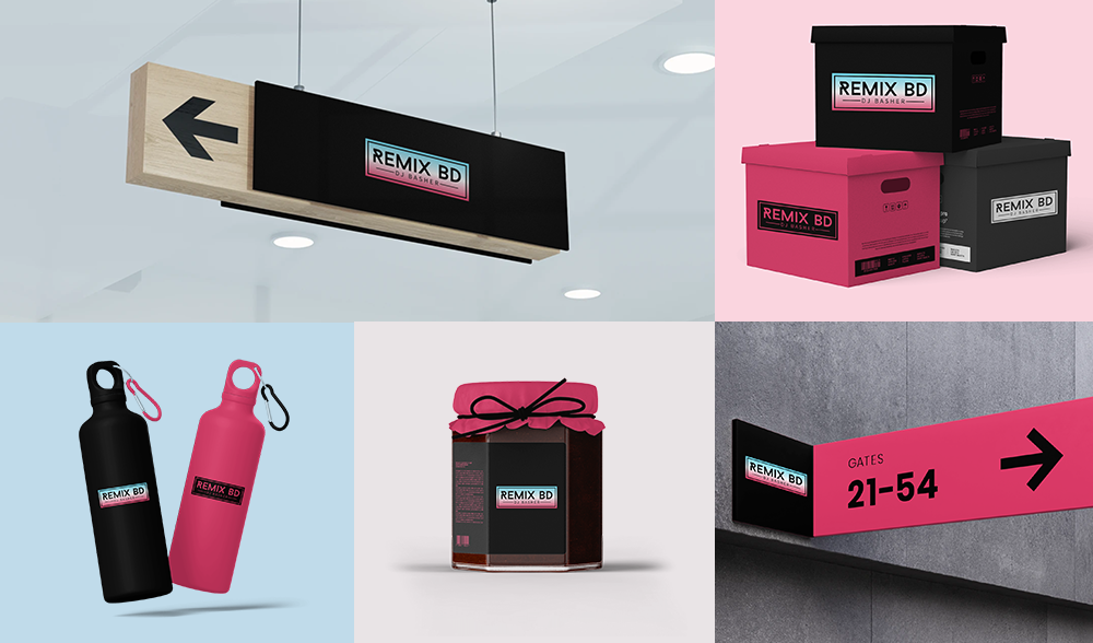 Download logo mockups from LogoAI's brand center
6. Unconventional Shape With Gradient
 👆Click to edit logo
When you incorporating non-traditional shapes into your logo design, it already give people the impression this is aa very bold and unique brand. If you want to make your target audience remember you as even more cut-edge company, you can try to use contrast gradient color which will be very eye-catching and memorable. If you just looking for add slightly depth for your logo, a smilier color hue will be a good choice. 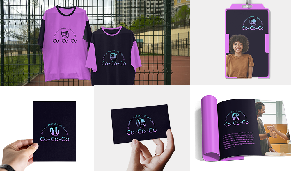 Download logo mockups from LogoAI's brand center
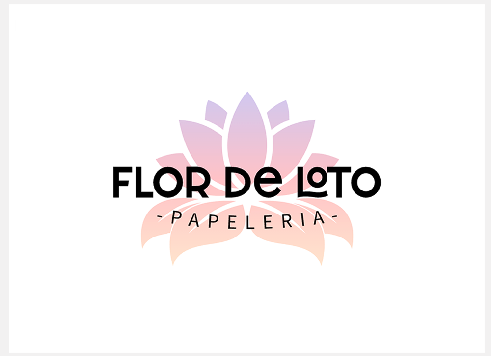
7. Fading Gradient Symbol with Overlayed Logo Name
 👆Click to edit logo
This approach highlights the text by contrasting it with the fading background, ensuring it stands out clearly. This combination creates a sophisticated and visually appealing effect, making both the symbol and name integral to the overall design.
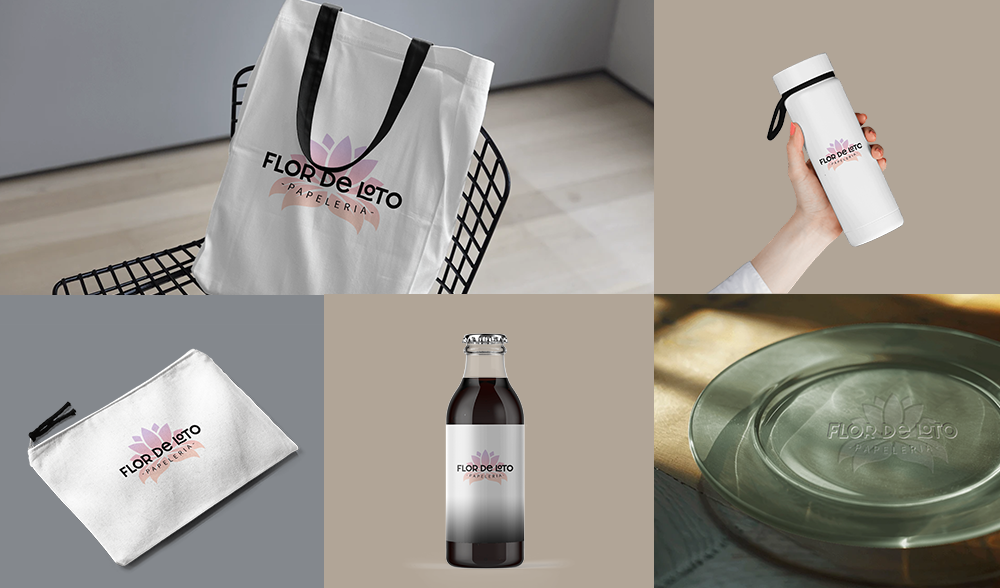 Download logo mockups from LogoAI's brand center
8. Gradient Monogram Design
 👆Click to edit logo
This technique involves applying a smooth color transition across the monogram, which adds depth, dimension, and a modern touch to the design. The gradient can range from subtle shading to bold, vibrant color changes, depending on the desired visual impact. This design feature helps make the monogram more eye-catching and distinctive, adding a contemporary flair while maintaining the elegance of the traditional letter-based symbol. You can use our free monogram maker to craft a distinctive letter monogram for your logo design.
 Download logo mockups from LogoAI's brand center
Final Thoughts
In conclusion, gradient logo design offers a versatile and impactful way to enhance your brand's visual identity. By experimenting with various gradient effects, from vibrant color transitions to subtle fades, you can create a logo that stands out and effectively communicates your brand's personality. LogoAI's logo templates provide a range of options to inspire and guide your design process, whether you're aiming for a bold, modern look or a more refined, elegant touch. Embrace these techniques to craft a memorable and distinctive logo that captures attention and leaves a lasting impression.