
After spending numerous hours to experiment the best typography of your logo, the next step will be choosing the right color combination. Colors always evoke certain emotions in a person and that is how a company forms its image. The logo colors will turn out to affect audiences’ perceptions of the brand and enhance every interactivity that is conducted with customers. So as to help you make this important decision, we have gathered 10 of the most popular examples that will guide and help you to create the perfect logo for your brand.
Understand the types of color combinations
One of the things that will benefit you in showcasing your design is learning the types of logo color combinations. Whether you use complementary or contrasting colors, it will help you color your logo more strategically. Moving on, let's try to cover them quickly:
- Monochromatic color combinations: Of all the colors, One color is used at different tones to combine the colors.
- Analogous color combinations: A color scheme where 2 colors can be formed at either sides of a split a circle and one seems 'closeness' to the other.
- Complementary color combinations: Colors that are directly across from each other on the color wheel.
- Triadic color combinations: A scheme comprised of a tri-secting 3 colors within a triangular shape of the color wheel.
- Tetradic color combinations: Consisting of four colors that come from two tone complements.
10 Inspiring Logo Color Combinations
Here are 10 logo color combinations that will surely motivate you and enhance your brand. These examples are composed of an unusual combination of colors which can help in making your logo more attractive by providing diverse options for any kind of design. Click the logo image below to do further editing to create your own.
01. A Harmonious Blend of Yellow
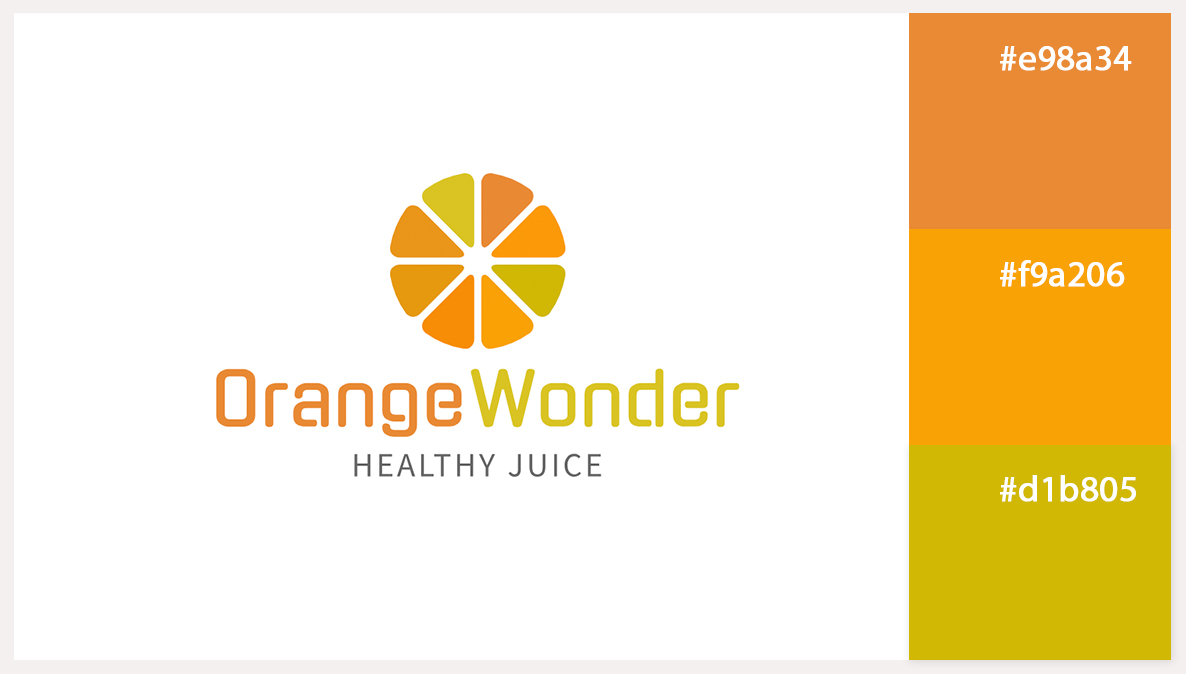
Yellow represents physical energy, keenness, and cheerfulness which is needed from a health oriented drink logo design. There is no need to worry about using only one tone of yellow. You can explore the range from the lightest of pastels to sharpest of sun yellow. It is best to have a uniform color theme so that the viewer seams the snapshot as a single dish, without feeling bored. It also goes a long way in helping to market the company’s values of freshness and energy within the logo in a calm but efficient manner.
02. Light and Dark Green
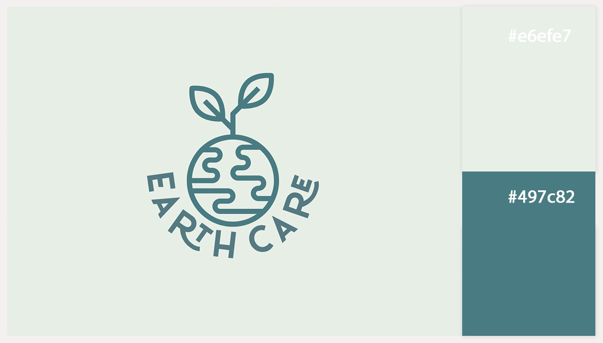
Combining various hues of green helps fulfill delicate and stunning harmony environmental Logo design. Pale green background gives a serene atmosphere which is soft supporting the logo's pastel look. Stronger green which is also seen in the form of the logo name as well as in the earth symbol enhances the look by providing a non–drawn out inhibition. This color combination works towards the growth and sustainability of the concept in focus while ensuring that everything remains intact.
Make your own logo in seconds!
Try It NowMake your own logo in seconds!
Try It Now03. Green And Black
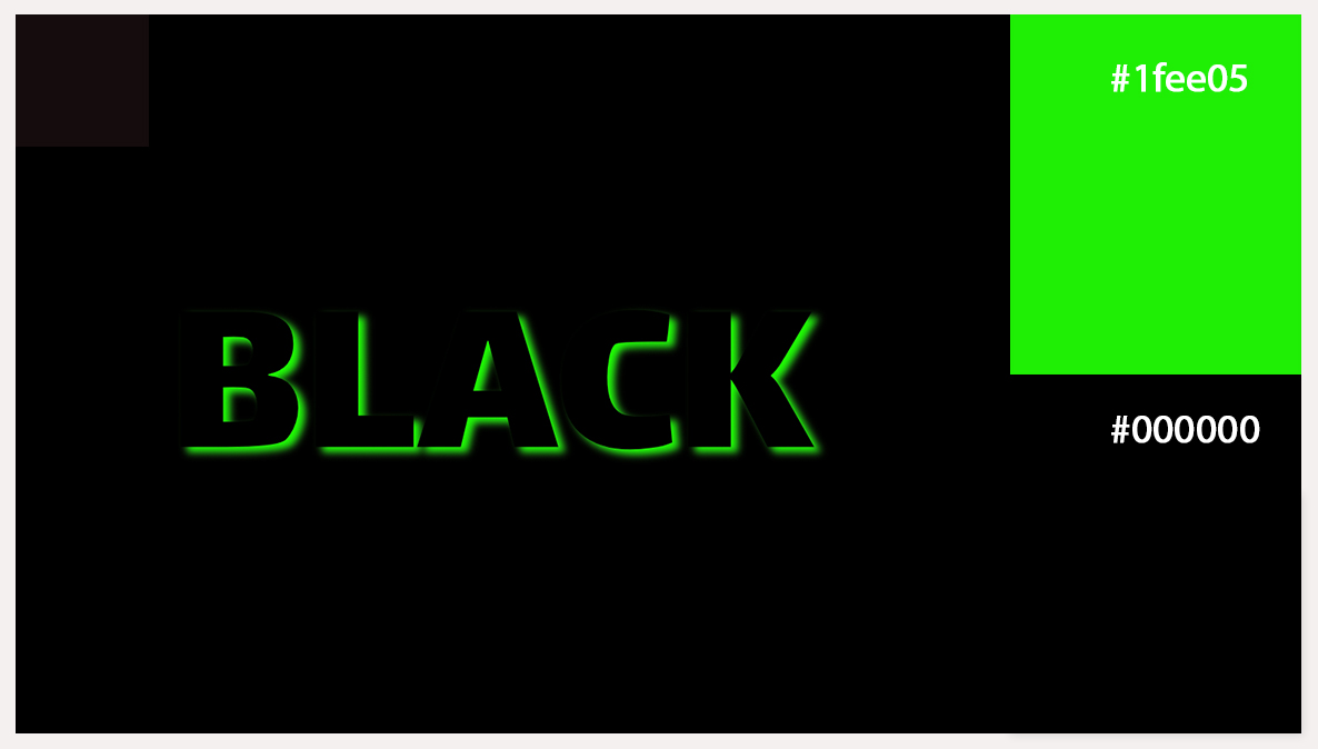
Vitality and courage is what the black font color offers since it is sturdy and formal. This black text logo design provides a respectable and classic base. Still, the green shadow adds a very brilliant and appropriate complement, which makes the text more striking and decorative against the dark background and adds action, no less. Metaphorically speaking, this detail complements the identity of the logo. It is bright, up-to-date and has a dose of high energy which makes the logo so effective and memorable.
04. Navy Blue And Red Color
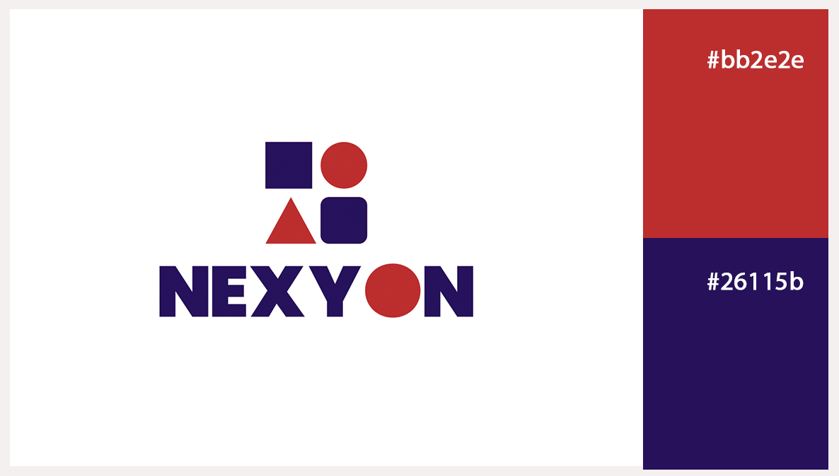
The navy blue color is placed on the two rounded squares to indicate trust, stability, and professionalism which is a good base color for a brand. The red color is used on the triangle and the circle to ignite up, increase warmth and also make a visual contrast. This strategic use of color makes sure that the rounded squares feel stable and authoritative while the red triangle and circle add a striking bold movement that captures attention. Sometimes just a simple color technique can give a perfectly balanced and attention retaining design that any brand wishing to be innovative and confident.
05. Yellow, Orange and Black
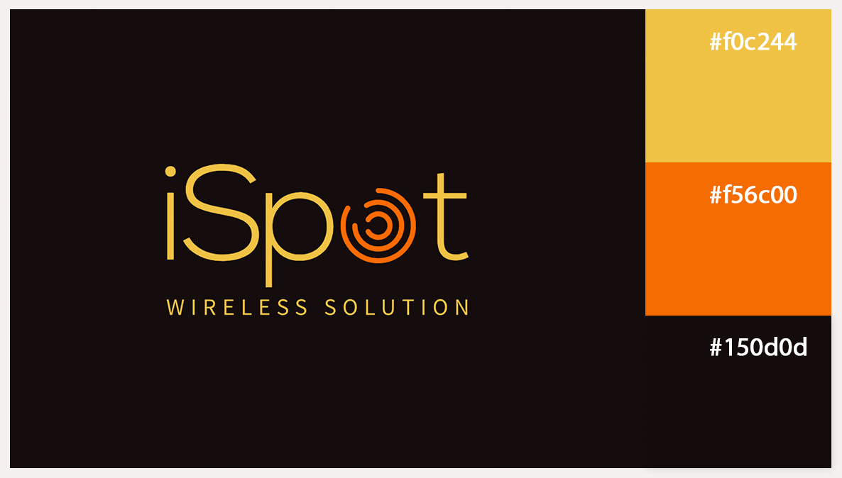
This logo design looks daring and dynamic. Hot stamping process used yellow has a very positive inclination, and also in this case it helps focus the attention to important details. Together with orange which has warm and imaginative qualities she stands out even more against the black background. Black background is a modern touch to the design offered which when combined with bright colors makes them more conspicuous. This colors combination helps to achieve brand awareness of young and active and also self-confident character.
06. Green, Watermelon Pink, and Off-White
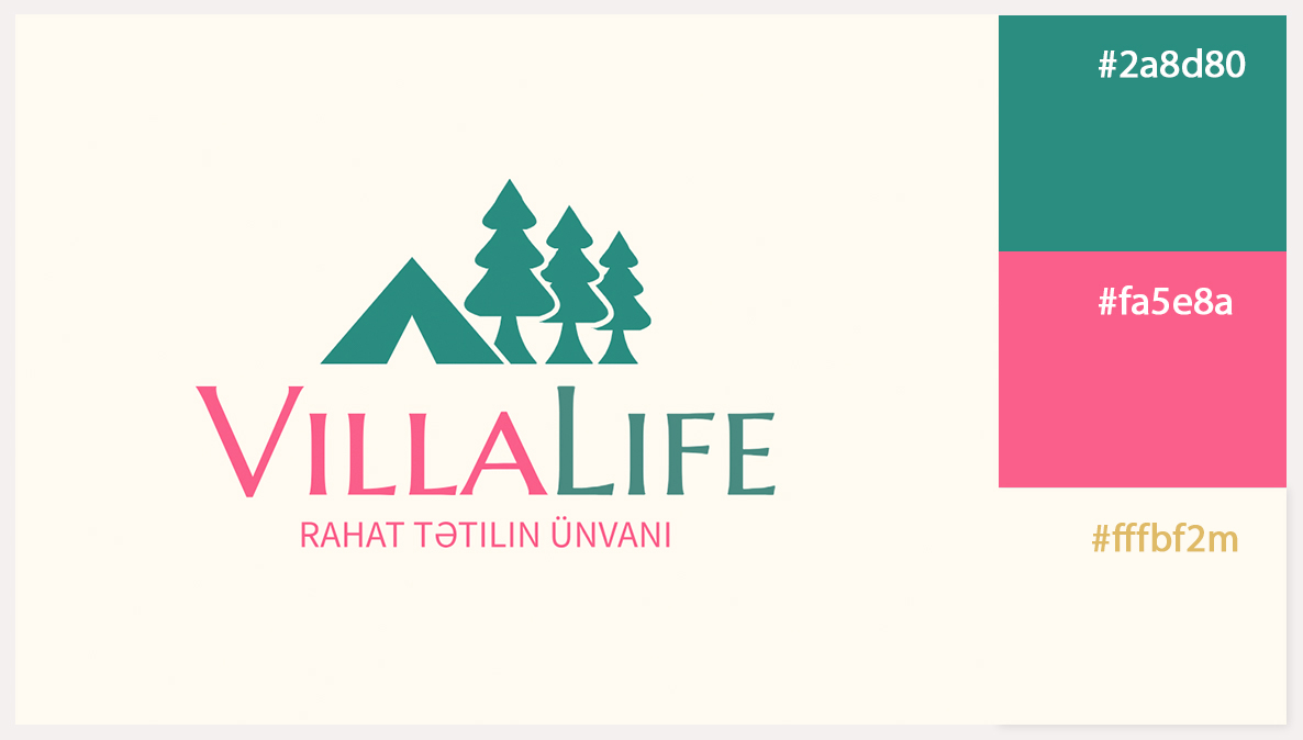
Green can be said to score high in relation to nature and is thus the best color for the tree symbol which enhances growth and peaceful living, great for enhancing the tree symbol. Pink accents and softening design elements add creative warmth that makes the design more friendly. Bright colors such as light yellow complete the color scheme with the qualities such as cheerfulness and optimism which makes the logo rather bright.
These colors are appropriate for a lifestyle brand such as this one that has its focus on home and nature, doing activities that are relaxing and including the use of the brand into the logo into a pleasant way.
07. Coral, Yellow and Dark Shade Purple
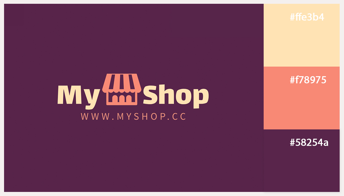
The combination of coral, yellow, and a dark shade of purple creates a bold and vibrant contrast. Coral brings warmth and energy to the design, while yellow adds a cheerful, welcoming touch. The dark shade of purple provides a sense of sophistication and depth, balancing the brighter tones. This color trio works well to grab attention while maintaining a stylish and modern look, making the logo both visually appealing and memorable for your brand.
08. Hot Pink, Yellow and Bright Blue
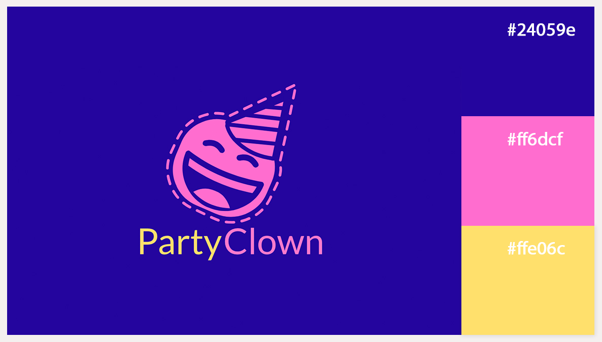
This party logo use of hot pink, yellow, and bright blue looks energetic and has a festive appeal. Hot pink adds excitement and focus to the design, while yellow is a cheerful color that adds more fun. Bright blue gives balance, adding a fresh and energetic burst to the bright color combination. This active color combination would help ensure the logo, which is geared toward fun and enjoyment as a brand would not be easily forgotten and successfully translates the idea of fun and celebration one way or the other.
09. Blue, Bright purple, Orange and Grey

The mix of colors blue, bright purple, orange and grey makes an impressive and corporate logo. Blue represents trust and certainty that is core in establishing trust with clients especially in such times when various companies are striving to win more clients, and vivid purple brings out the artistic and sophistication essence to show that there is an aspect of creativity and knowledge. Orange adds a friendly and inviting aspect making the company look very warm and nice. The grey in the palette arrives to complement the other colors with a sense of decorum and juxtaposition providing refinement and serene in the design. This mix of colors reassures the viewer and stimulates the creative part of the individual’s mind.
10. Blue, Green, Yellow And Coral red
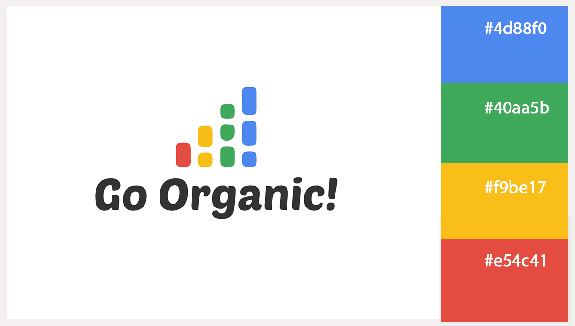
The combination of blue, green, yellow, and coral red in a logo creates a vibrant and engaging design. Blue offers a foundation of trust and professionalism, while green adds a touch of growth and harmony. Yellow injects warmth and optimism, making the design feel lively and inviting. Coral red introduces a bold, energetic flair that captures attention and adds excitement. Together, these colors create a balanced and dynamic logo that conveys both reliability and enthusiasm, ideal for brands looking to project a positive and engaging image.
Wrap up
To sum them all up, choosing the right color in branding is very important. When selecting a color palette for your logo Design, you need to think about how many colors you will have in a logo. For some simpler logos, one or two colors is a more common practice since it conserves the message that has to be portrayed while more-than-plain logos may include quite a few of such extra colors for a more vivid look.
Look at the impact that each of the colors has on the customer and the emotions it brings out with respect to the brand. Select colors that are visually attractive but also preferred by the people you are trying to sell your product to. There are different forms of organizing a combination of colors – whether monochromatic, analogous, complementary, triadic, tetradic. That is why it is possible to choose the right combinations which will serve the purpose, including rhetorical of what is appreciated about the brand.