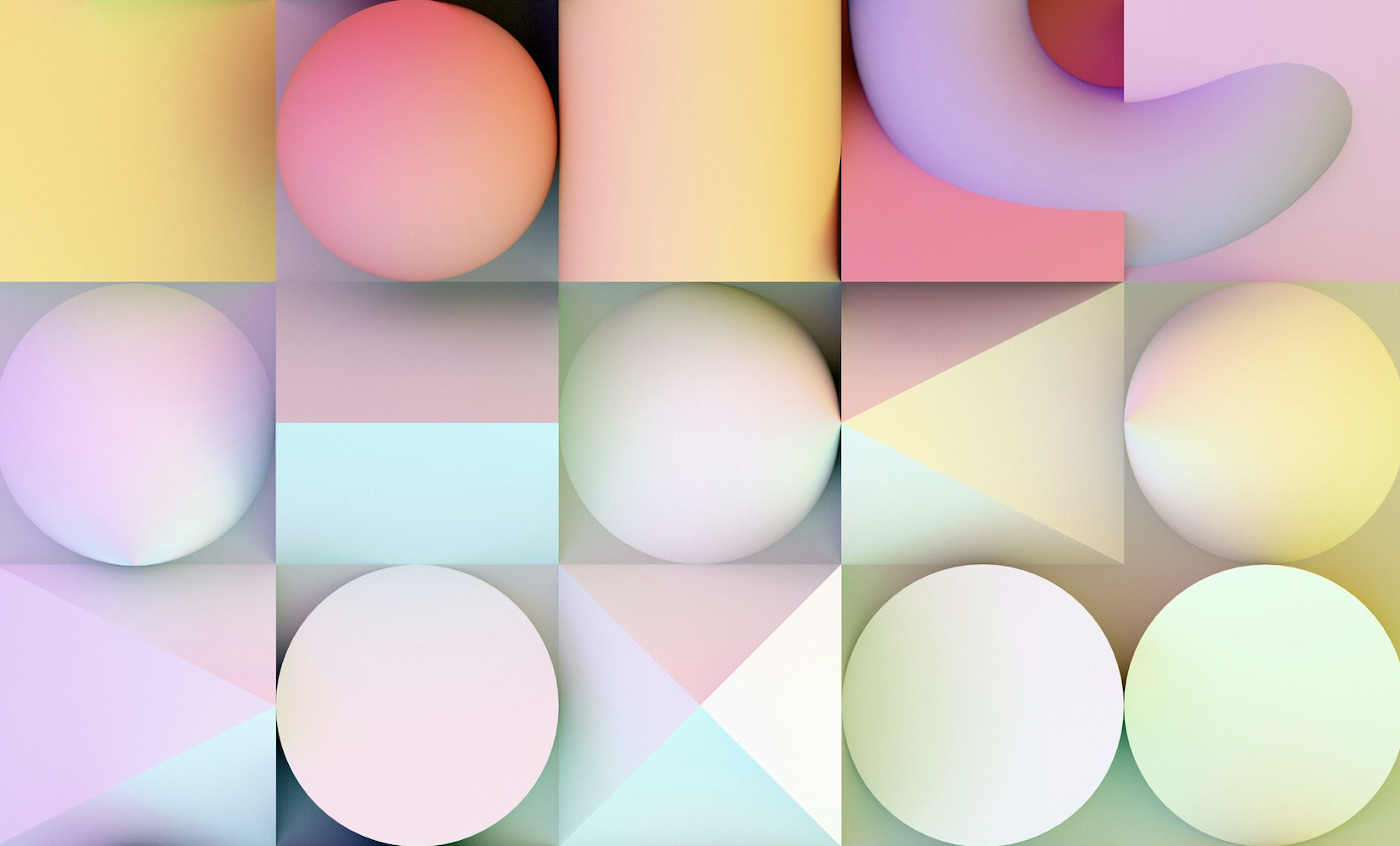

Do you ever think about why a particular logo evokes a certain feeling? That’s because the logo was made to communicate a specific message and emotion through its shapes. Our brains are wired to relate to and recall shapes, which make a certain prominent shape stand out. This is why unusual logos leave a mark on us. When designing a new logo, it's important to consider the psychological meanings of different shapes.
Here's a rundown of logo shapes and analyze how each reflects a brand’s identity.
1. Round logos
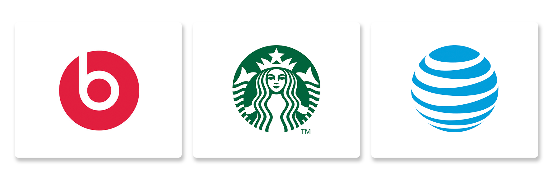
Round logos, including circles, ovals, and ellipses, are one of the most beneficial designs because they constantly give off positive energy and sound appealing. Design friendly brands use round logos as they appear approachable due to their smooth edges.
Circles emit feelings of wholeness and protection which make them great for branding. Rounded shapes like ovals and ellipses give a feeling of movement and progress because they are more stretched out, making them ideal for brands that want to show innovation.
To build strong emotional bonds and improve relatability, circles, ovals and ellipses are the best shapes a brand can go with for logo designs.
2. Squares and Rectangles
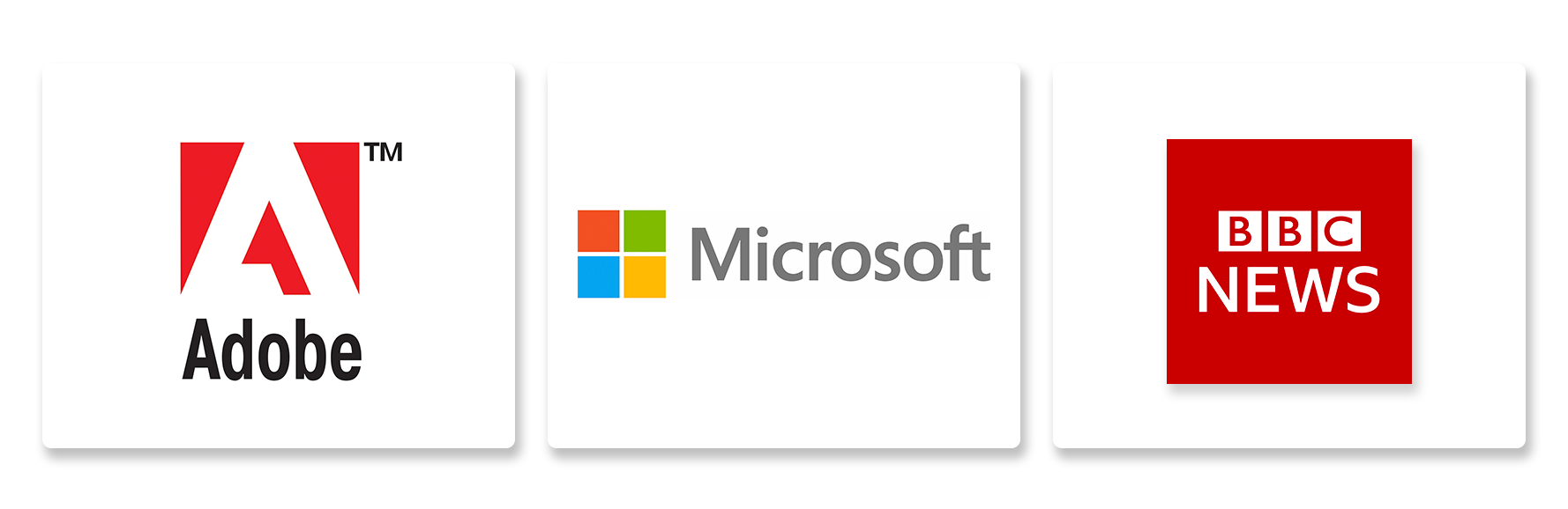
Squares logos represent professionalism, reliability, and stability. Their straight lines and straight edges represent order and structure. It creates a feeling of trust towards the brand.
Rectangles portray strong and powerful brands while squares give brands a sense of balance and equality. In addition, these shapes are quite functional and practical, which benefits brands with a no-nonsense approach.
Logos that need to convey dependability and reliability often use squares and rectangles. These shapes are commonly found in logos of finance, technology, and construction companies where a strong sense of professionalism is needed.
Make your own logo in seconds!
Try It NowMake your own logo in seconds!
Try It Now3. Triangles Logo
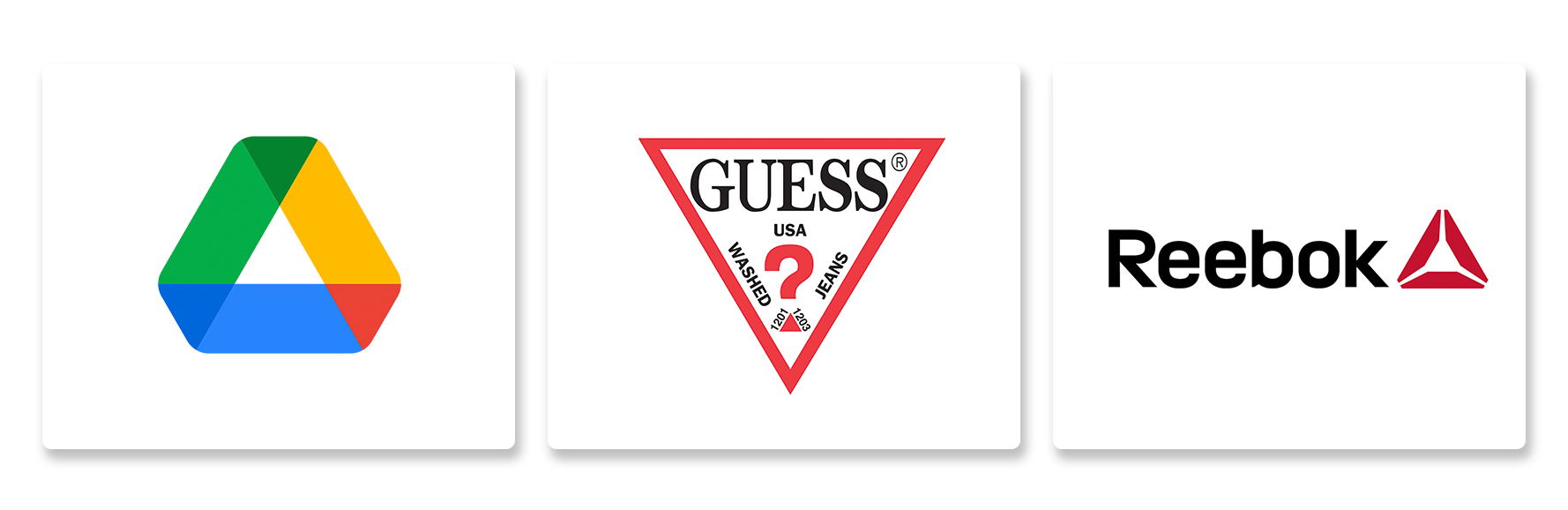
Triangle logos can symbolize power, strength, or stability, depending on which way they're pointing.In addition, triangles can give a sense of direction or progression, making them ideal for brands that want to portray movement. Also, triangles can add an exciting and dynamic feel into a logo. So, if a brand wants to express strength, innovation, or energy, then using triangles in their logos will help achieve that.
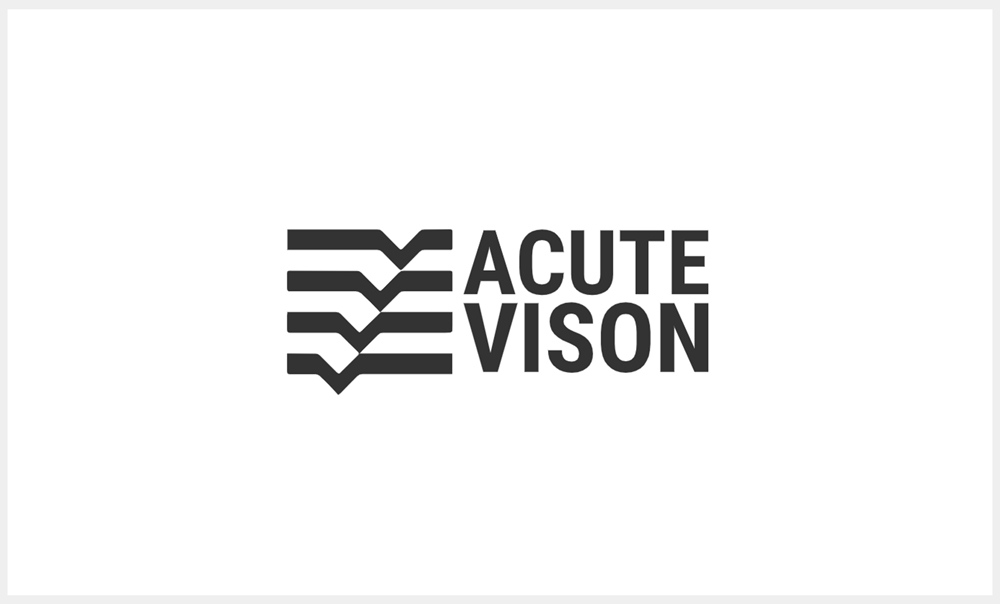
4. Horizontal Lines
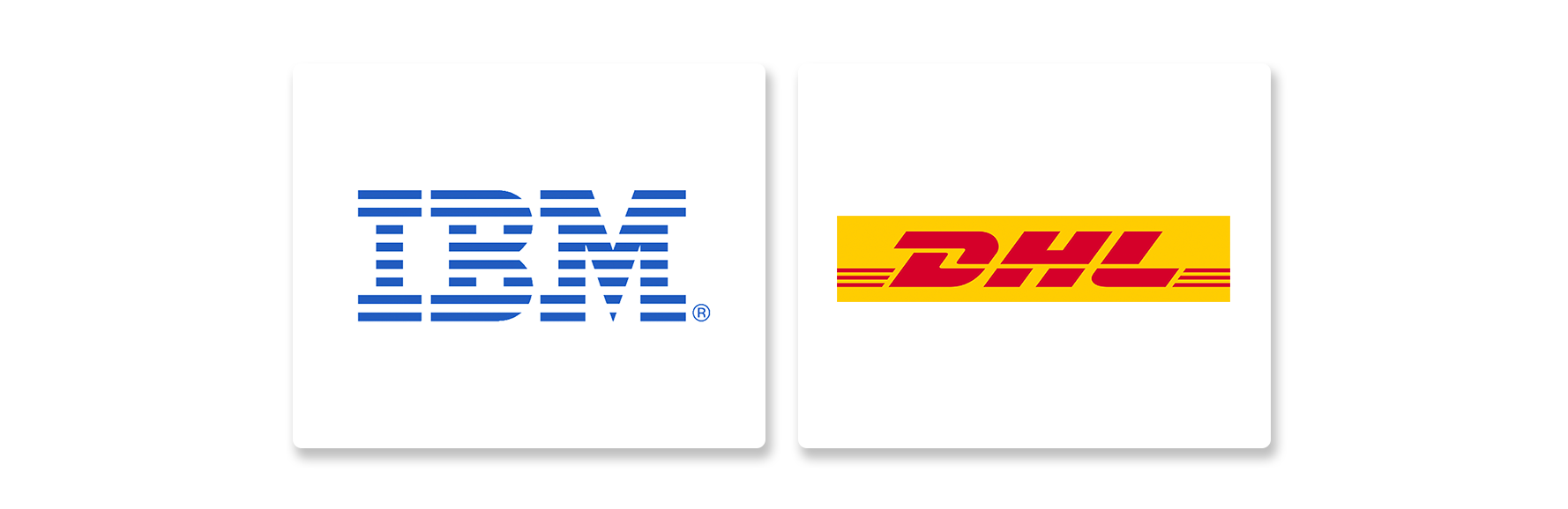
Some companies use horizontal lines for their logos because it reflects a relaxed and calm culture. Do you see how the horizon appears? Its balanced and peaceful in nature.
These logos help brands create an impression of being calm, reliable, and not difficult to deal with. When customers see such logos, it makes them feel like everything is well organized. These types of designs are ideal for companies that want their customers to feel safe and relaxed such as spas, wellness and any other business aimed towards creating peaceful environments.
5. Vertical Lines
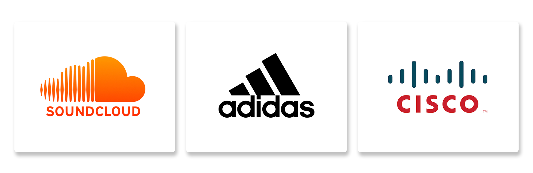
Vertical lines in a logo can can convey important meanings. Vertical lines evoke a sense of power and dominanvce because they remind us of vertical structures such as skyscrapers and trees. For companies wishing to portray an image of ambition, constantly improving, or growth, using vertical lines on logos gives a perfect impression.
Vertical lines can also imply elegance. This makes them gread for brands seeking a more classy image.
If a brands goal is to appear classy, refined, strong or even a bit ambitious, using vertical lines could help them achieve that.
6. Abstract Shapes
Abstract logos can spark people's imagination, and allow them to interpret the brand’s meaning. In addition, abstract shapes serve to express one’s creativity without boundaries. These shapes can easily be modified to fit the brand's identity, ideals, or any specified concept. This gives opportunity to formulate an exclusive mark that defines the essence of the brand.
This makes it even more interesting, because abstract shapes can easily be changed or improved over the duration of time, allowing the brand to stay up to date while preserving the core of the identity.
Thus, as the brand seeks to stand out, showcase its creative side, and have a logo that evolves with the brand, an abstract logo is a perfect solution.
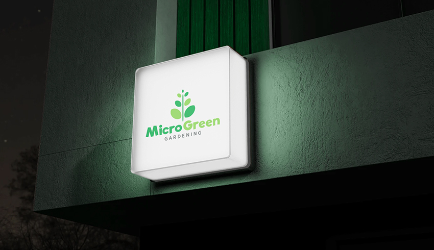
7. Curves
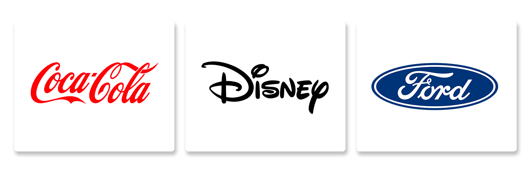
Curves always appear to be friendlier than other shapes. When compared to sharp angles, curves have a softer and more nature-like appearance. Movement or flow is usually associated with curves, and logos become more inviting and dynamic with the use of curves.
Since curves are associated with femininity, they also convey softness and elegance which helps in brd adopting a sophisticated image. They are also easy to adapt into letters, icons, or the logo’s borders making their application limitless.
In conclusion, brands aiming for an image that is warm, friendly, and elegant should utilize curves when designing logos. The positive emotional connection formed with the audience alongside the logo differentiation makes the use of curves smart.
Choosing the right shapes to form your logo design
Now that you have learned the psychology behind shapes, reflect on your company's values, persona, and audiences. Explore the logos of your competitors for inspiration and don’t be afraid to blend shapes or use them as embellishments. When in doubt, remember that less is more, and you’ll design a logo that resonates with your audiences.
If you follow these suggestions, take these aspects into consideration, along with thoughtful shape selection, you will be able to create a logo that captures the essence of your brand while making an impact.
Design Your Logo with Unique Shapes Now!
Ready to bring your brand to life with a unique shape? Click the images below to start designing your own logo in seconds!