For those who are designing minimalist logos but still add a unique eye-catching element, changing the color of one or two of the letters is a great way. This simple yet effective approach can draw the viewer’s attention from the ocean of other plain text logos, while still maintaining the readability and overall minimalism. In this post, we will explore how this technique is utilized by brands such as Mobil to help you design your own logo.
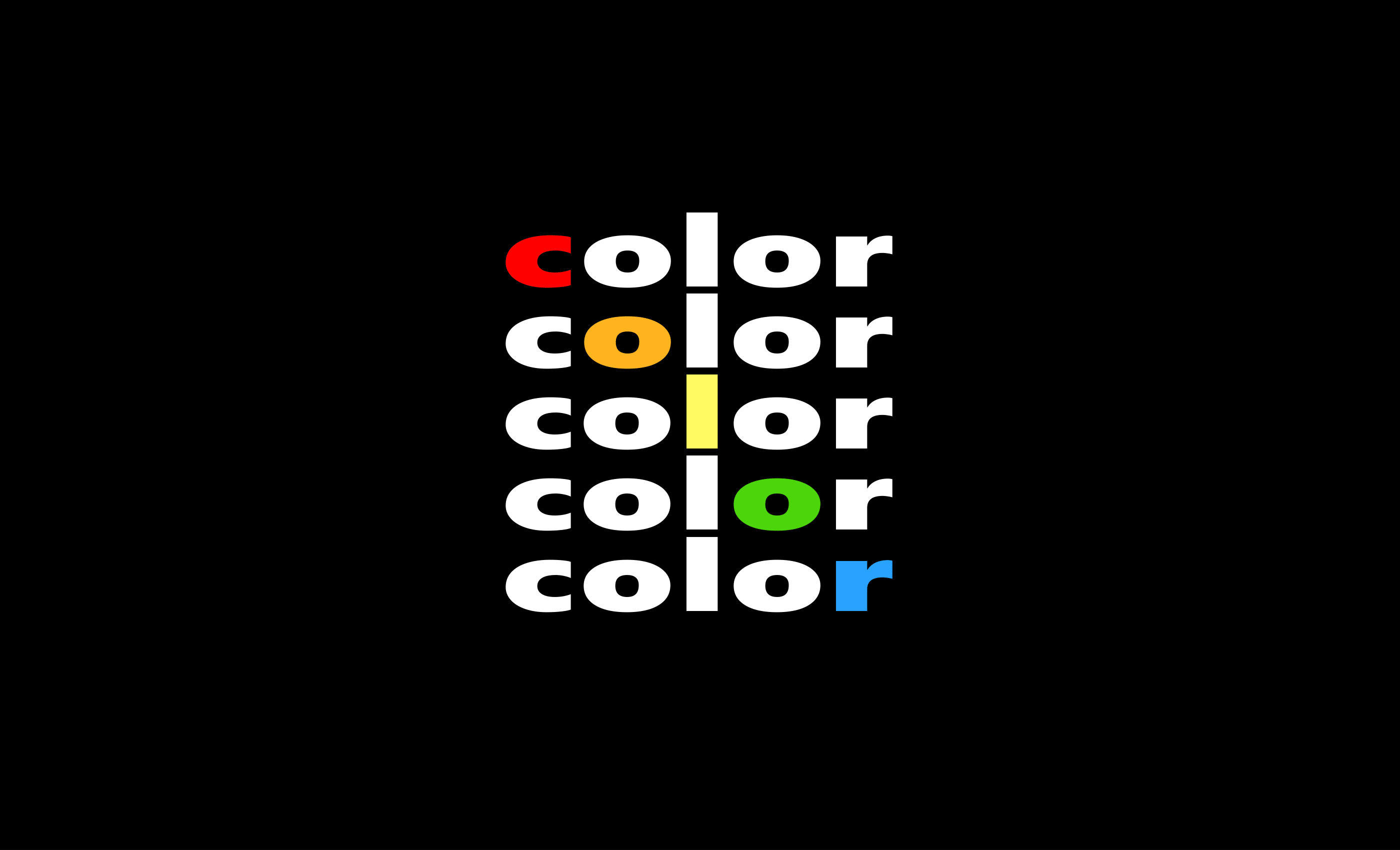
1. Using color to accentuate important information

The petrol company Mobil is one example of a logo that utilizes a singular well placed accent letter to make a memorable logo. According to the iconic design firm Chermayeff & Geismar that created this logo, the red O is meant to simulate a circular oil pump. It also acts as a way to indicate the pronunciation stress, making the brand name easier to pronounce for worldwide customers. Like Mobil, you should also think carefully about the significance of the letter you choose to alter in your logo.
2. Emphasizing the first letter
 ⬆️ Click the template above to make your own edits
In this Qreation logo, the first "Q" is altered to be red, making both the letter and slogan stand out from the rest of the text. Rather than making the entire logo black, this pop of color adds dynamism and conveys possible emotions for your brand through the color choice. The addition of the red slogan makes clear what kind of business this logo is for while keeping the coherence of the color palette.This technique is especially useful when you want to make the memorable first letter an important part of the brand identity.
3. Emphasizing the center letter
 ⬆️ Click the template above to make your own edits
In this Nike logo template, the “i” in the middle is substituted to become black rather than bright red. It differs from many other logos that tend to use the brighter color as the "pop" of color, and the black "i" being the outlier makes the design seem more memorable and unique. While unconventional, the eye is drawn to the center of the logo, grounding it and providing coherence with the motto "Just Do It!" in black at the bottom.
4. Using a unique font
 ⬆️ Click the template above to make your own edits
When designing a minimalist logo like PURE, the choice of font plays a crucial role in enhancing the impact of a singular colored letter. A unique font can amplify the effect of the accent color, making the altered letter even more eye-catching. For example, a bold, geometric font can make the colored letter stand out sharply, while a softer, more rounded font can create a subtle contrast that draws attention without overwhelming the viewer. In this logo, the choice color of light blue conveys cleanliness and purity, making it the perfect choice for this health care brand message.
How To Color Your Letter
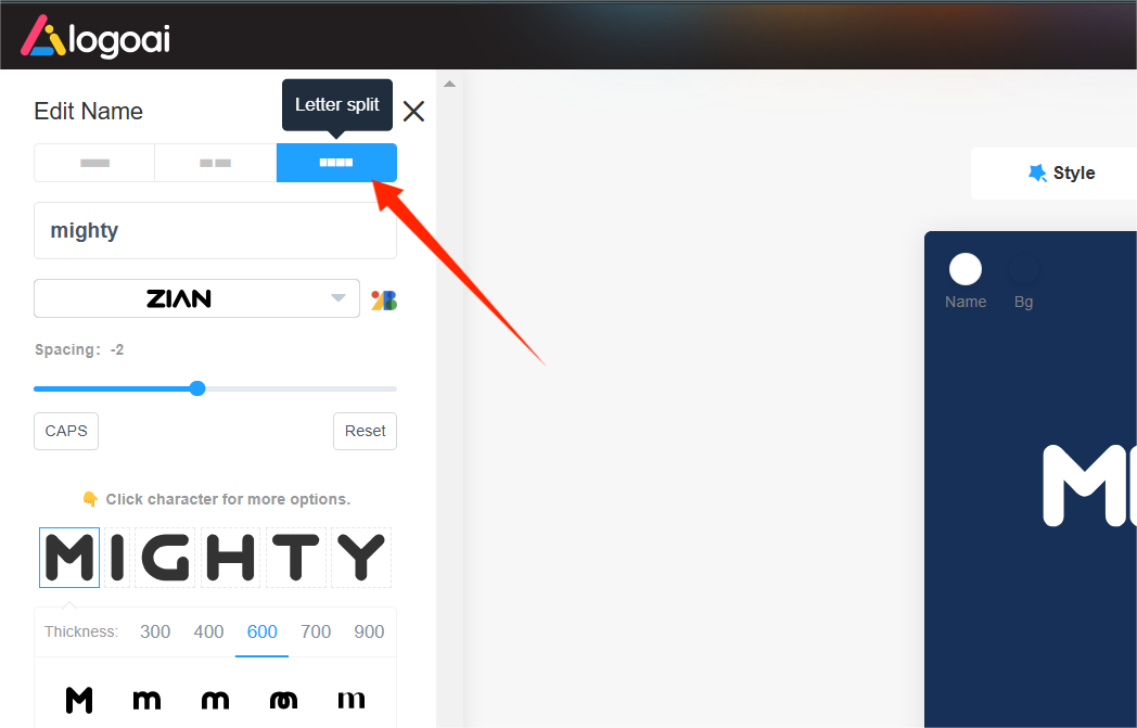
Step 1. Split the letters
Click the letter split tool located at the top left corner of the editor to split the text into individually editable letters inside the LogoAI logo maker.
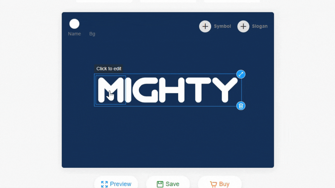
Step 2. Double-click to change the color
You can then double-click to select each individual letter to alter the font style or color, as seen below:
The process to create your own color text logo couldn't be simpler!
Wrap Up
In conclusion, using color creatively within a text-based logo can transform it from simple text to a memorable and impactful brand identity. The aforementioned techniques and elements to consider can ensure that your logo stands out while still maintaining its sleek and minimalist aesthetic. So go ahead and experiment with your design using LogoAI's logo maker, and discover how a small shift can make a big difference in your brand’s visual presence!


-1741076768.png)
-1740565993.gif)