Custom letter spacing is a feature that might be less known as it is not frequently utilized in the logo designing process. But it should be noted that the distance in the letters significantly contributes to a logo’s readability, balance and overall aesthetics. Knowing how to implement custom letter spacing helps you to create a logo that not only look beautiful and are eye-catching, but also represent the brand in a more effective way.
What is Letter Spacing?
Letter spacing also called tracking is the adjustment of the amount of space between every letter in the paragraph text. It enhances the balance of the text. When tracking is increased, the letters are spaced wider apart, and the sense is said to be more open. Decreasing tracking reduces space and letters come closer together in appearance. Tracking can also be incorporated in design for emphasis and aesthetics mostly in titles and logos.
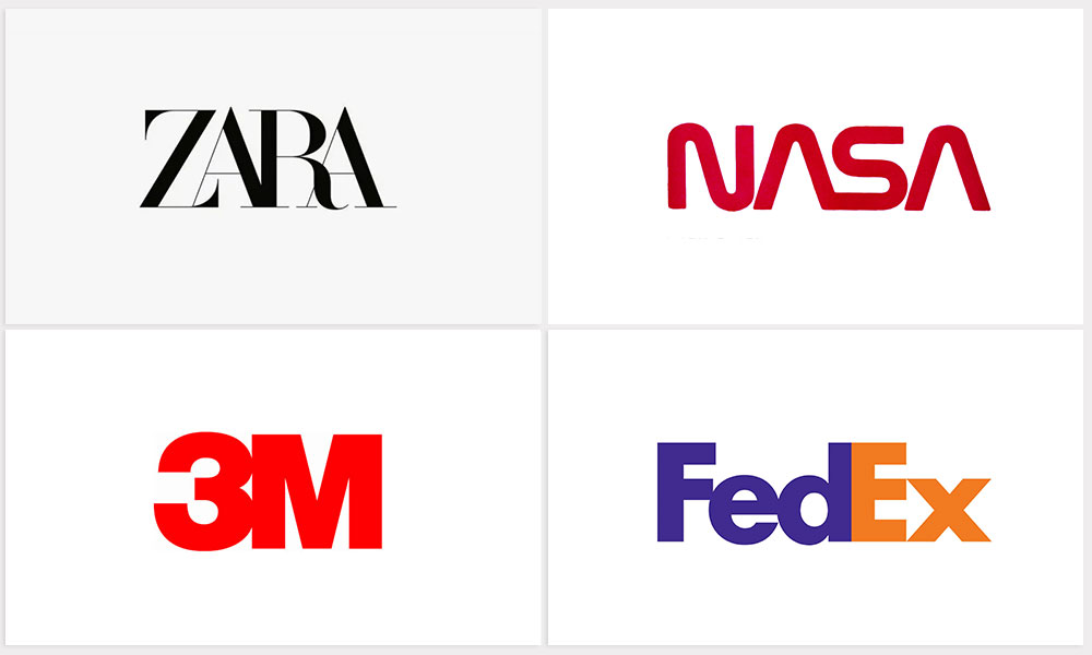
Here are some well-known logos that utilize the letter spacing technique:
The Importance of Letter Spacing
In logo design, letter spacing plays an important role as it helps shape one’s perception of the logo at first sight. Here’s why it is important and some practical suggestions:
Clarity and Readability: Correct letter spacing makes it easier to read the text, as the letters are not crowded together or placed too far apart.
Balance and Visual Appeal: When letters are properly spaced, the balance is achieved, which makes the logo look more attractive and alluring to the audience. When the spacing is inconsistent, it can break the structure of the design and feel rather unfinished.
Brand Personality: Lettering can add a personality to the logo; when it is spaced out, that is how simple and classy it can be, but when it is closer together, then it has a more contemporary or technological feel.
Kerning Key Pairs: Make sure that you pay attention to the kerning when dealing with pairs such as AV and WA because minor tweaks can enhance the quality of the logo dramatically.
Testing at Different Sizes: Confirm the letter space and size to check if it is readable and shows good proportions when viewed from a close distance as well as from a distance.
Make your own logo in seconds!
Try It NowMake your own logo in seconds!
Try It Now
Letter Spacing Techniques
Here are some helpful tips for exploring letter spacing techniques in logo design.
Condensed Spacing for Bold Capitals
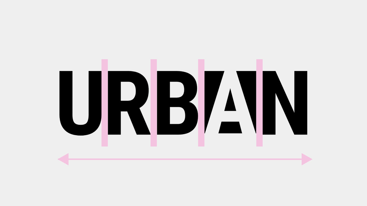
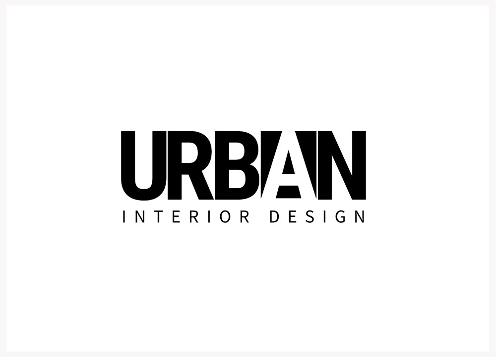
The key design element of tight letter spacing featured in this wordmark logo “Urban” is crucial for the smooth, modern, and somewhat compressed look of the logo that is characteristic of the professional environment of interior design. -3 letter spacing scale has brought the letters close enough to achieve a powerful yet uncluttered impression that grabs the viewer’s attention without being too busy. Highlights of this branding scheme include the use of monochrome while the cut-out letter “a” provides contrast through the use of negative space.
Circular Letter Spacing for Balanced Symmetry
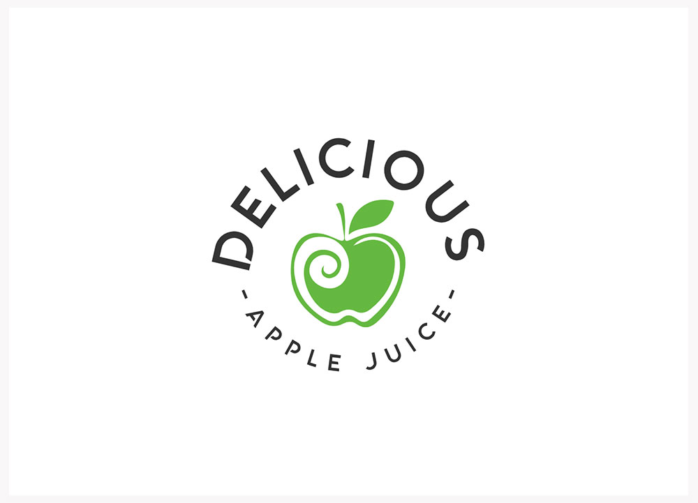 The name “Delicious” and the slogan “Apple Juice” are inscribed on the outer side of a green apple image within a circumscribing circle. The letter spaces are slightly increased so that the stroke rises and falls more smoothly, while still looking nice and evenly rounded from all angles of the curve. This type of design helps to ensure of the letters when it does not stand out from the whole text around the mark.
Extended Letter Spacing for Balanced Alignment
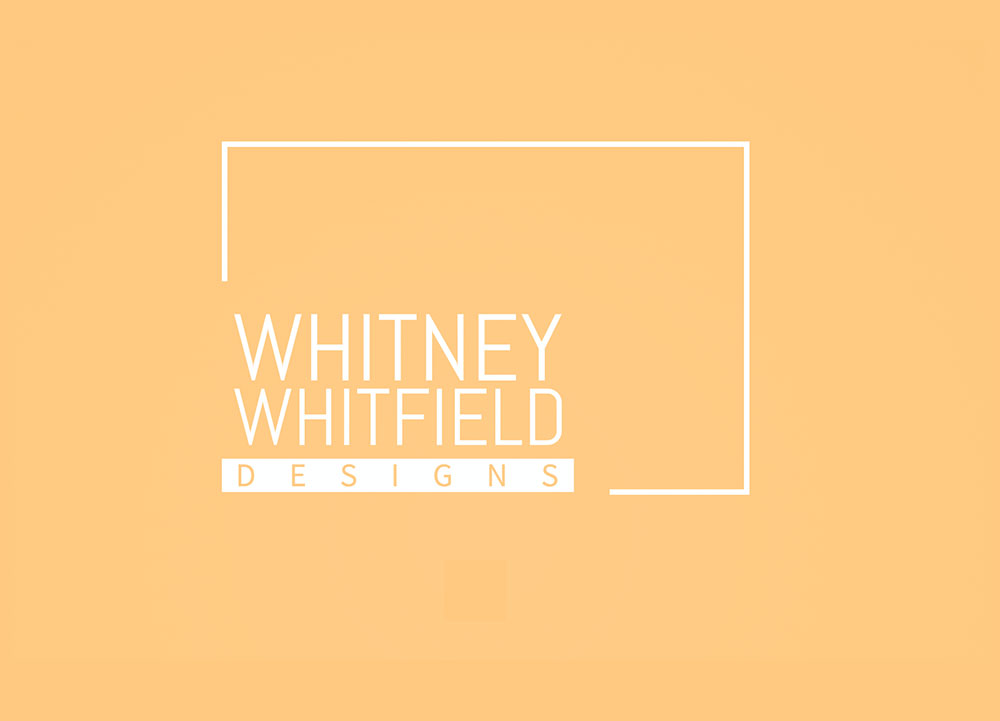
The increased letter spacing of the logo slogan adds visual balance to the entire logo design. This minor tweak harmonizes both the elements improving the logo’s neatness and well-structured look whilst giving the design a distinct sense of unity.
Tight Letter Spacing for Handwritten Logo Style
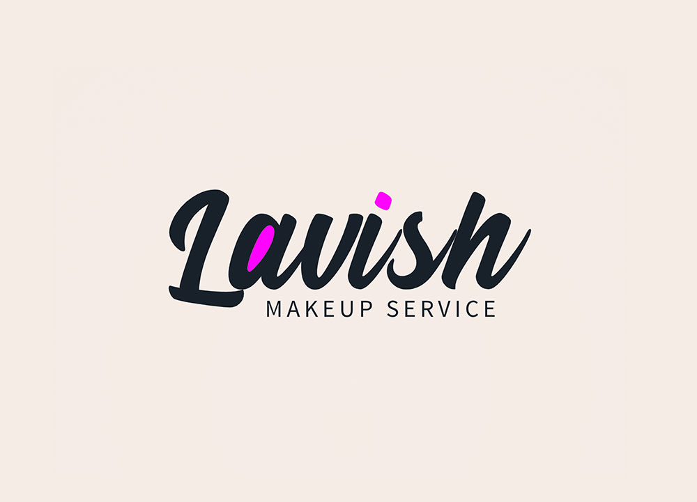 The letter spacing of this handwriting logo design is -13 which brings the characters close. This approach gives a sense of closeness to the logo and makes it feel handwritten in a smooth way without losing legibility.
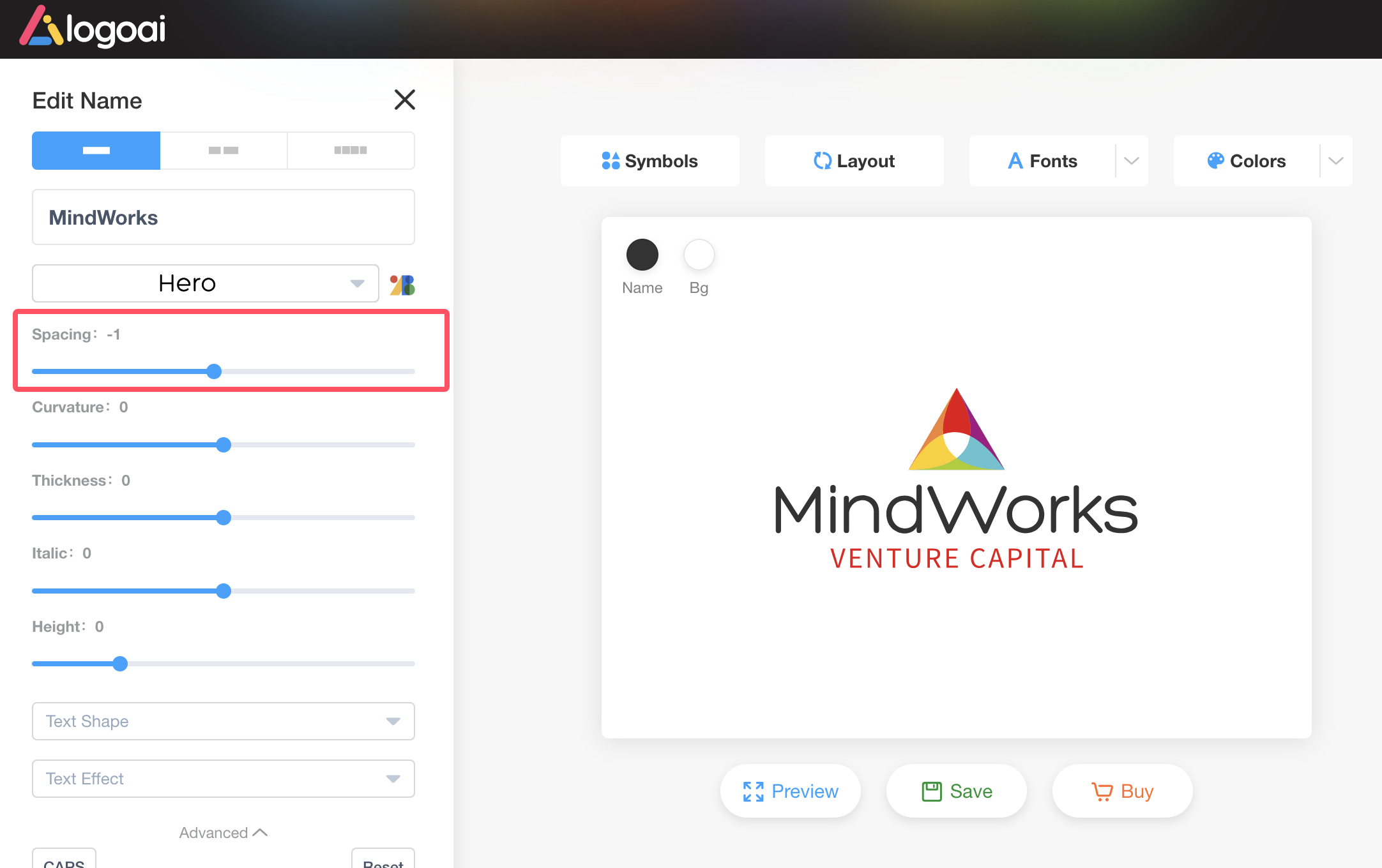
How to Adjusting Letter Spacing with LogoAI
In LogoAI’s editor, select the part of your logo you’d like to adjust, such as the logo name or slogan. On the left side, you can easily modify the letter spacing to fit your design style. For more options, click on Advanced to access additional features like curvature, thickness, italics, and text height. You can also explore adding text shapes and effects to create a special text effect logo.