The background of your logo might seem like a small detail, but it plays a huge role in how people perceive your brand. A simple basic background or a more sophisticated one, whatever the case background can make or break the logo. It can also either compliment your logo's design or take away the focus from it. This article will demonstrate the impact of background design on logo design, and why it is relevant in the process of creating a logo.
Match the Background Style with Your Brand
The background style should align with your brand's personality:
- Modern logo opt to solid background colors thanks to its versatility.
- Classic brands are more likely to use simple patterns or muted colors as they lean towards classical designs.
- Playful brands, on the other hand, tend to choose vivid colors and extravagant patterns.
Make sure to select a background that complements your logo and at the same time goes well with your business’s idea and brand moodboard. It should come across as very easy and relate to what your business is all about!
5 Different Types of Logo Backgrounds
Each type of background has its specific use depending on the brand's style and the logo’s purpose.
1. Solid Colors
Solid color backgrounds are clean and versatile. They can help a logo stand out without adding extra visual noise. Here are common solid colors:
Make your own logo in seconds!
Try It NowMake your own logo in seconds!
Try It NowWhite
White looks great with most logos since it gives a tidy and clean impression. It works for a minimalistic professional look and feel and it works great for a lot of logos.

Black
Because lighter tones stand out better against a black background, it is important for stronger contrasts. This trend is very common in giving the logo a polished, or contemporary makeover. Excellent for use by luxury and premium brands.

Color
Using a colored background can add more style and energy to your logo. Pick a color that suits your brand’s identity. Just make sure it does not compete with your logo design but rather enhances it.
2. Gradients
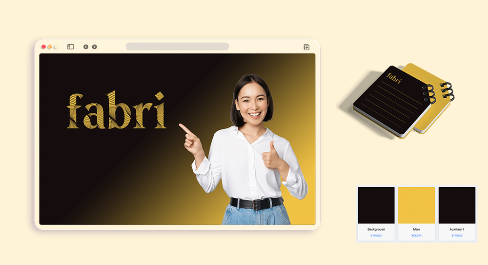
Gradients help in creating depth and dimension on the background. They create a blend of two or more colors which gives a more up-to-date and dynamic feel.

3. Patterns and Textures
To add a more individualized or imaginative twist, patterns and textures give emphasis. Geometric, brushed, or even a faint texture are examples of these types of backgrounds that enhance a logo’s modern or artistic effect. Just be cautious; too many details or character to a pattern may have the opposite of their intended effect as it can be a distraction from the logo as well.

4. Photos or Imagery
Typically, a background image has much more to it than just aesthetics, especially if it maps to your business. However, this option also needs a delicate balance and some discretion; an image which has too much detail may overshadow the logo design. One useful suggestion is to select an image with a degree of blurriness or very low contrast that holds the text interesting while letting the logo still dominate the view.

5. Transparent Backgrounds
A transparent background is easy to adapt, enabling a wide range of application. Thanks to it, your logo does not have to be framed with a box and can be placed on different surfaces. This is particularly helpful for online sites, product packaging and others which have quite some flexibility. If you already have a logo, you can use our Logo Background Remover to remove logo background to create transparent PNG file.
Tips for Choosing Backgrounds
When you make a decision regarding the logo background, you should be aware of how that specific background will help or hinder your logo. Here are the 5 considerations that must influence what you employ as a background and how you utilize it.
- Focus on Contrast
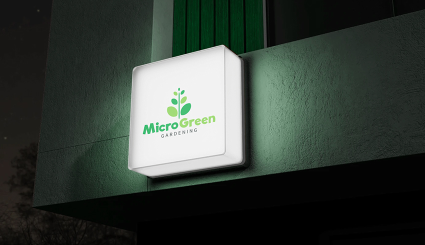
It is crucial to have contrast between the logo and the background. For example, light logo will stand better against dark background and vice versa. - Test Across Different Mediums
Test the background on different channels – websites, business cards, social networks, brand packaging etc. - Consider the Emotions of Color
Take a moment to consider what the background color would make your audience think about the brand. Blue is almost always associated with trust, while red is a color that evokes energy and excitement. - Use Transparency When Needed
A very effective means to ensure that a logo will be stamped over a number of surfaces. So it avoids stick-on looks and in such use cases, its very useful indeed. - Avoid Clashing Patterns
If you use patterns, make sure they don’t distract from your logo. Visually speaking, simple patterns with minimal graphic elements tend to be more effective in most cases.
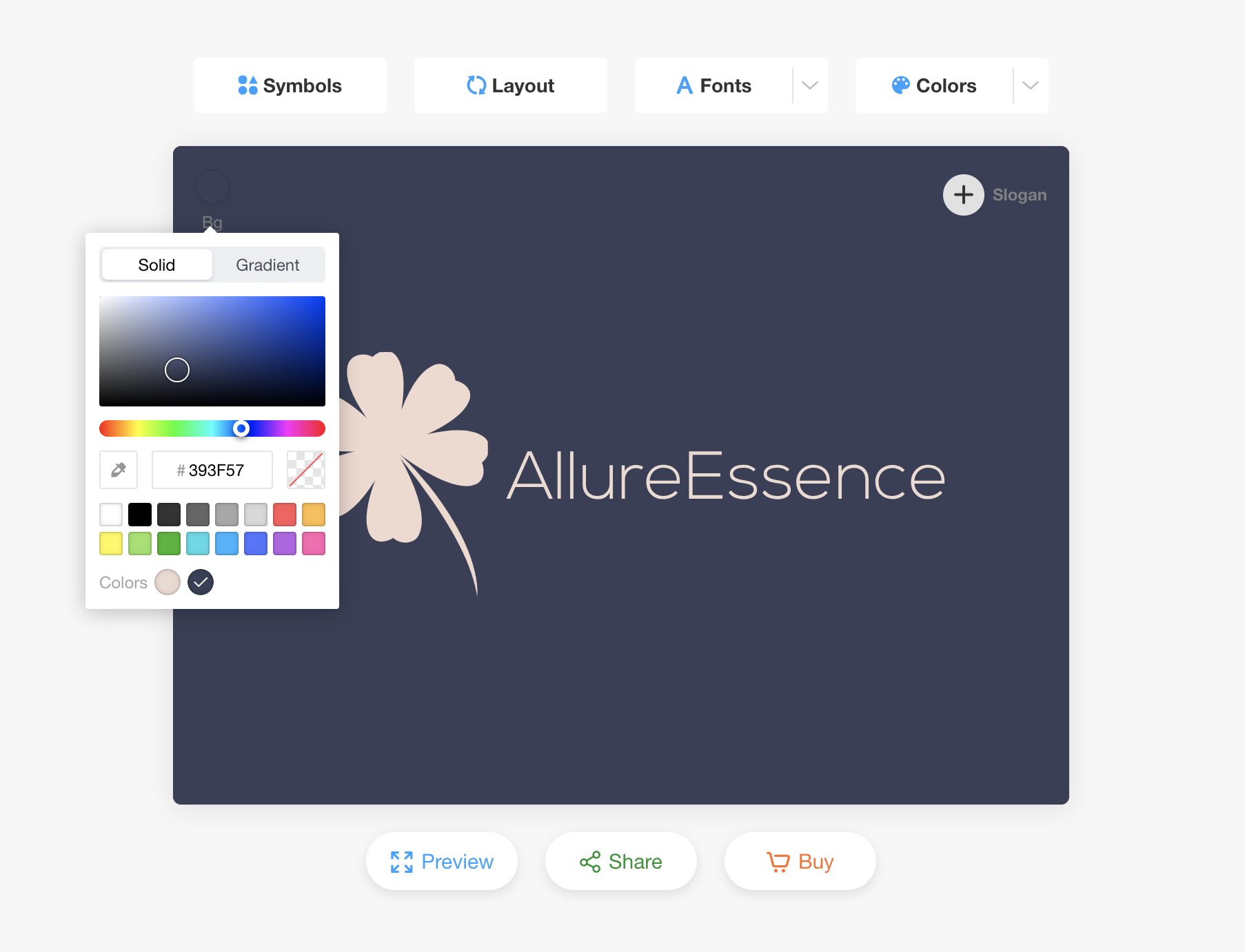
Change Your Logo Background with Our Logo Editor
With LogoAI’s Logo Editor, anyone can try out a variety of logo backgrounds including solid black, white, colored or gradient color. You can also simply click on the logo from logo editor to preview how your logo will looks like in different real life scenarios. Thus, making it possible for the user to select a background that will best enhance the aesthetics of the logo.
Click on the image below to try the Logo Editor now!

