The color scheme of the logo significantly determines how the target audience will perceive your brand. Emotions, messages, and decisions can be influenced by colors. The colors selected for your logo are not purely decorative, rather they are core elements of your brand image and connect with the needs of your audience. Here’s a comprehensive guide for creating the ideal logo color palette for your brand.
Understand Your Brand Identity
It is important to define the brand’s personality, values, and goals before choosing any colors. Some of the questions that need answering are:
- Would you describe your brand as playful or professional?
- How would you characterize your brand – is it elegant, environmentally-conscientious, or disruptive?
- What audience are you trying to communicate with?
For example, toys logos would most likely use loud and energetic hues but luxury logo design would want to use more soft hues or monotone shades.
Learn the Psychology of Colors
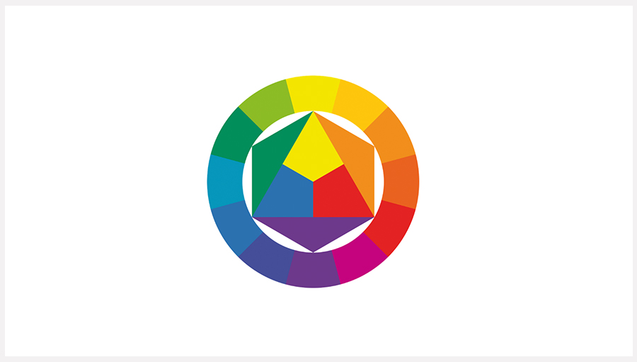
Understanding color psychology can assist you in selecting the tones that correspond to the message that you would like your brand to convey:
- Red: Energy, passion, excitement.
- Blue: Trust, professionalism, calmness.
- Yellow: Optimism, cheerfulness, creativity.
- Green: Nature, health, growth.
- Black: Sophistication, power, elegance.
- White: Simplicity, cleanliness, modernity.
Pick color schemes that tell a story to your audience and reflect the ideal character of your company.
Research Your Industry and Competitors
Take a look at what colors are commonly used in your industry. This understanding of the common colors in your industry can help you in making sure that your logo goes along with the industry but also could stand out from the crowed. Stand out while staying relevant to the industry is the key. If everyone in the industry has opted for blue, you might go for light blue with a sticker on it to create a unique logo, but do it tastefully of course.
The information from the industry, together with knowledge of the competitors, can assist you in maintaining relevancy to the market while setting your distinctive brand.
Make your own logo in seconds!
Try It NowMake your own logo in seconds!
Try It NowThe Logo Color Palette Formula
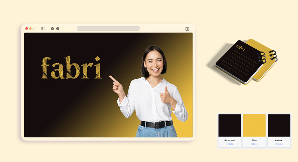
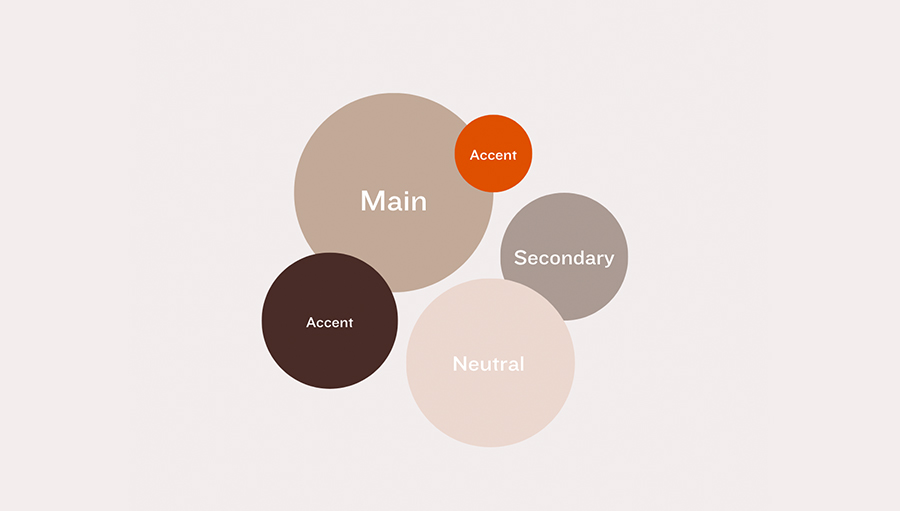
To creating a balanced logo color palette, these are the basic colors every brand needs:
- Main Colors: These are the dominant colors that define your logo’s identity, making it memorable and distinctive.
- Secondary color: Secondary colors blend in and complement your primary brand color without taking center stage (like a best friend). The easiest way to choose a secondary color is to take your primary color a shade or two lighter or darker.
- Accent Colors: These provide contrast and vibrancy, drawing attention to specific details within your logo.
- Neutral Colors: Supporting tones like whites, grays, or beiges that balance the main colors. They add subtlety and keep the logo visually appealing. Use neutral colors for logo backgrounds or written text.
Formula 1: One Main Color Brand
Example: Netflix's logo features a single red color.
The Netflix logo features a sleek and modern red wordmark logo design that in one solid color. As expected, red color of the logo reflects boldness, passion and energy fitting for a business that is all about entertainment and storytelling.

Click on the image below to create a logo with one main color.
Formula 2: Two Main Color Brand
Example 1: Mastercard has 2 Main Colors with Similar Hues
Mastercard uses two main colors, red and orange, which are close in hue, creating a warm, cohesive look. The two overlapping colors symbolize connection and partnership, with the red and orange tones conveying energy and optimism.
Example 2: Pepsi has 1 Primary Color + 1 Accent Color
Pepsi's logo uses blue as the primary color, with red as the accent. The blue represents trust and reliability, while the red adds vibrancy and energy, creating a strong contrast that makes the logo pop.
Click on the image below to create a logo with two main colors.
Formula 3: Three Color Brand
Example 1: Burger King has 1 Primary Color + 1 Accent Color + 1 Neutral Color Background
Click on the image below to create a logo with three colors.
Formula 4: Four or More Color Brand
Example 1: Microsoft has 1 Primary Color + 1 secondary color + 2 Accent Color Click on the image below to create a logo with three or more colors.
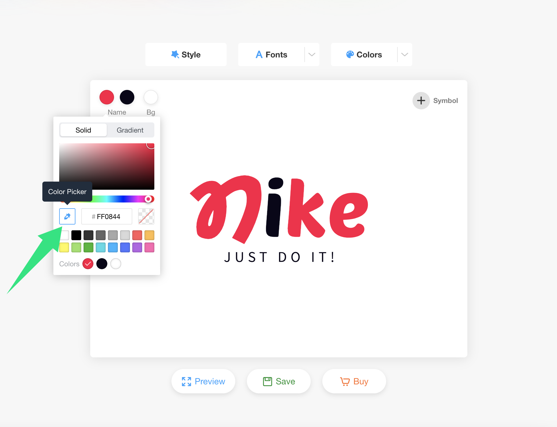
Color Your Logo with LogoAI's Color Picker Feature
With the new logo color picker tool, you can choose any color from anywhere on your screen in the quickest manner. This feature is quite handy especially when you see a color on a design and want to use those colors in your logo as well.
To pick the color, simply click on color picker icon to select the logo color picker option. The cursor will switch to a color picker tool. Just click the color you would like to apply and your logo is going to be modified.
Read the full guide here 👉: How to Color Your Logo with the New Color Picker Feature
Wrap Up
Creating your brand’s logo color palette is one of the most essential parts of establishing your brand. If you know your brand inside out, you comprehend color theory, do your homework for your niche, and use effective color palette ideas, you will design a logo your customers will love and will make them understand your brand’s philosophy.
LogoAI’s color picker feature allow you to play around with colors and tweak the design until you’re happy with it. Sometimes a simple logo color technique can make a big difference. Get started on your perfect Logo color palette now!

