-1739943346.png)


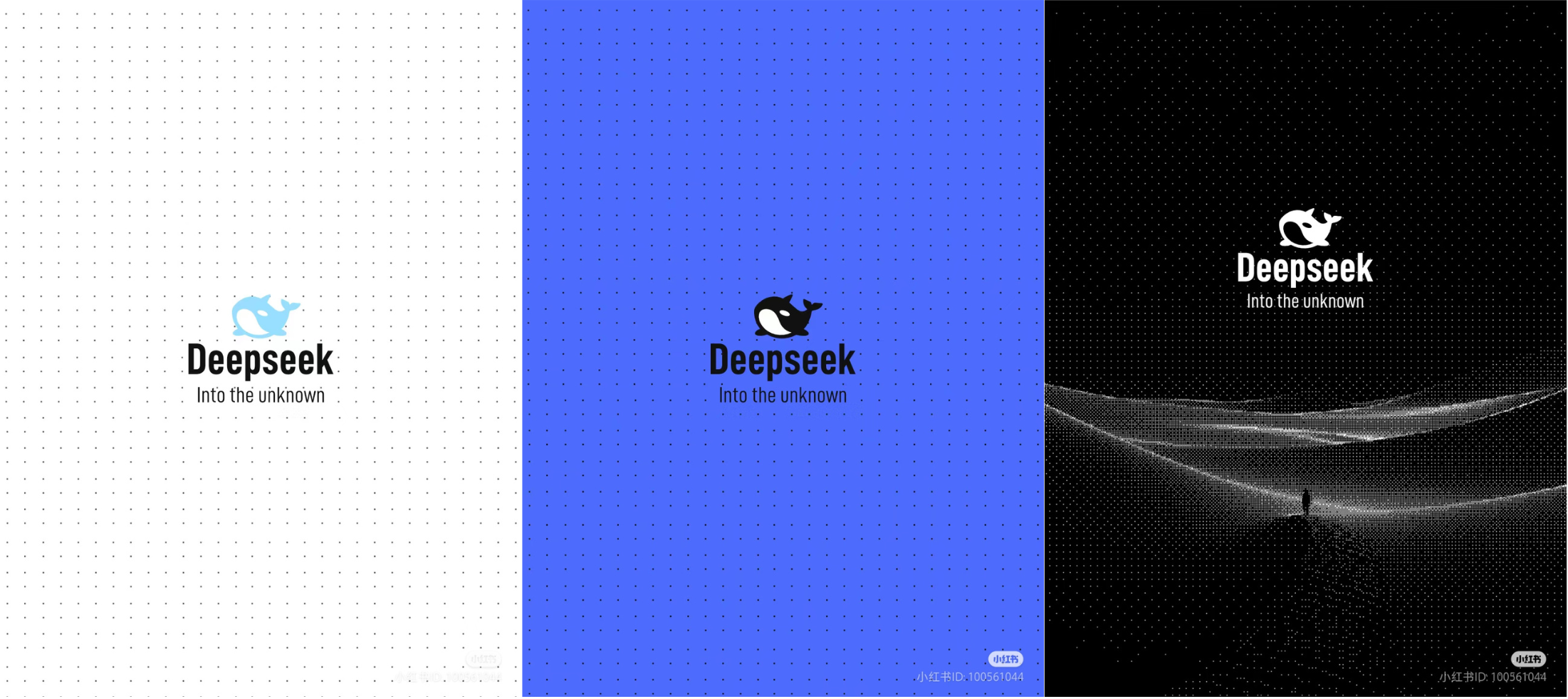
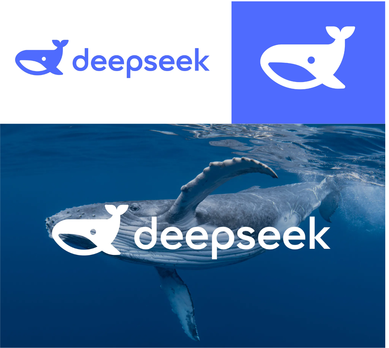
The skyrocketing popularity of Deepseek has made waves worldwide, from China to New York City's Wall Street. Inspired by its global impact, designers from around the world have taken creative liberty to reimagine the Deepseek logo—below we take a look at some of the most notable redesign proposals.
1. @江湖小蛀虫 on Xiaohongshu
This designer simplified the shape of the whale, and also added bitmap style elements like dots and pixels. This creates a high-tech imagery, making the Deepseek brand seem more contemporary.
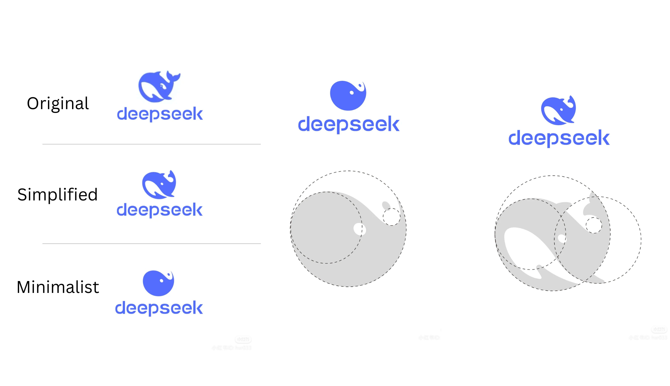
2. @如一LOGO on Xiaohongshu
This designer made a simplified version as well as an even more minimalized version, utilizing optimized circular proportions.
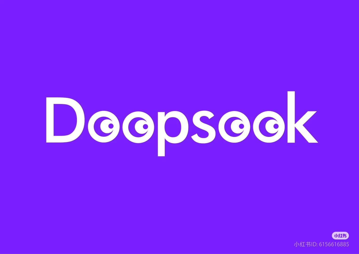
3. @200419 on Xiaohongshu
This designer uses the letter substitute logo technique to match all the letter "e" to be two pairs of eyes. The two eyes are meant to represent observing again, exploring again, and understanding again; it extends to a theme of "tirelessly exploring unreached territory". However, it's possible that this logo looks more like "Doopsook" than "Deepseek".
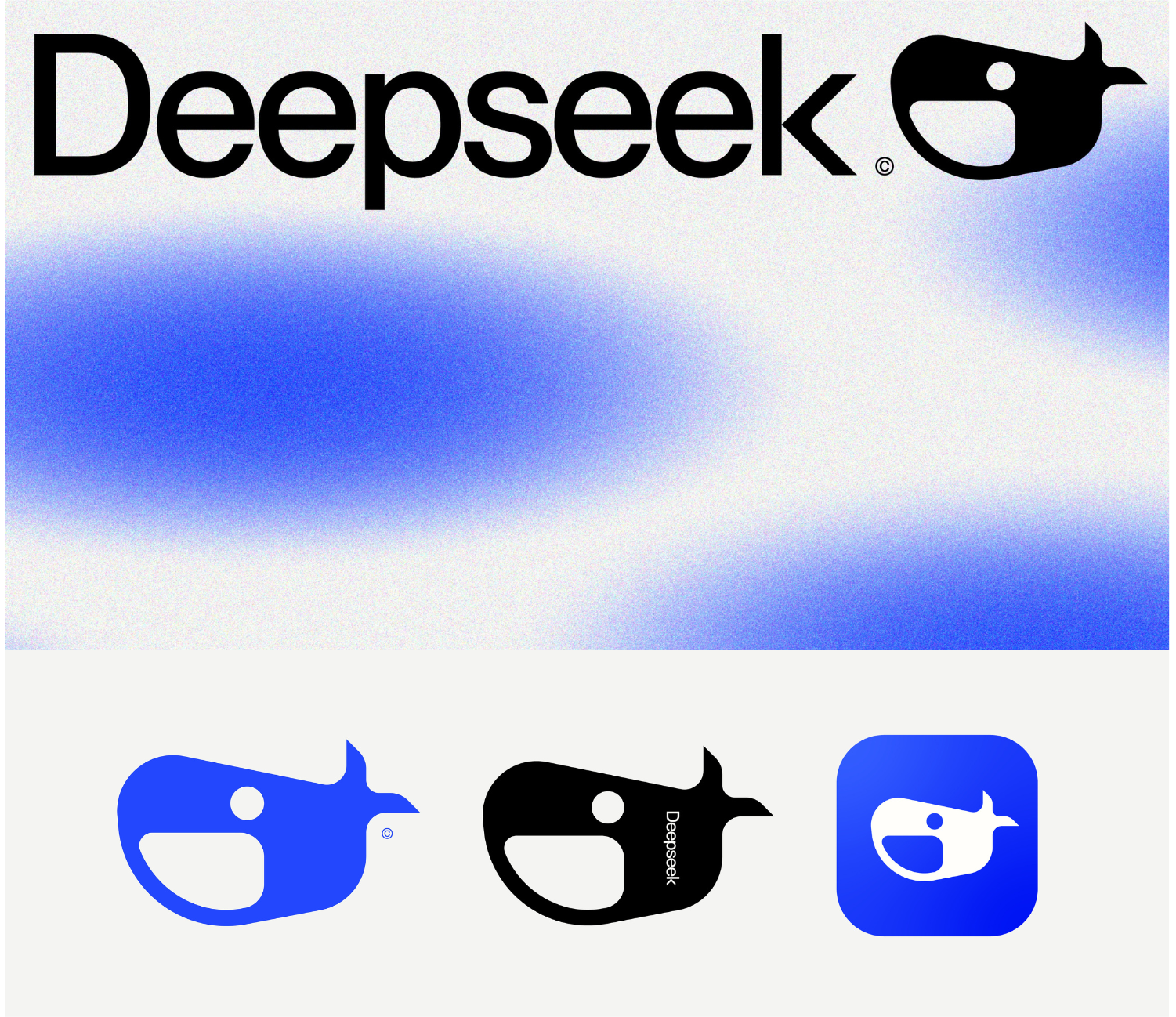
4. @Ruan V. on Dribbble
This design utilized sharper lines and a more honed font, removing the rotund friendliness of the original whale.
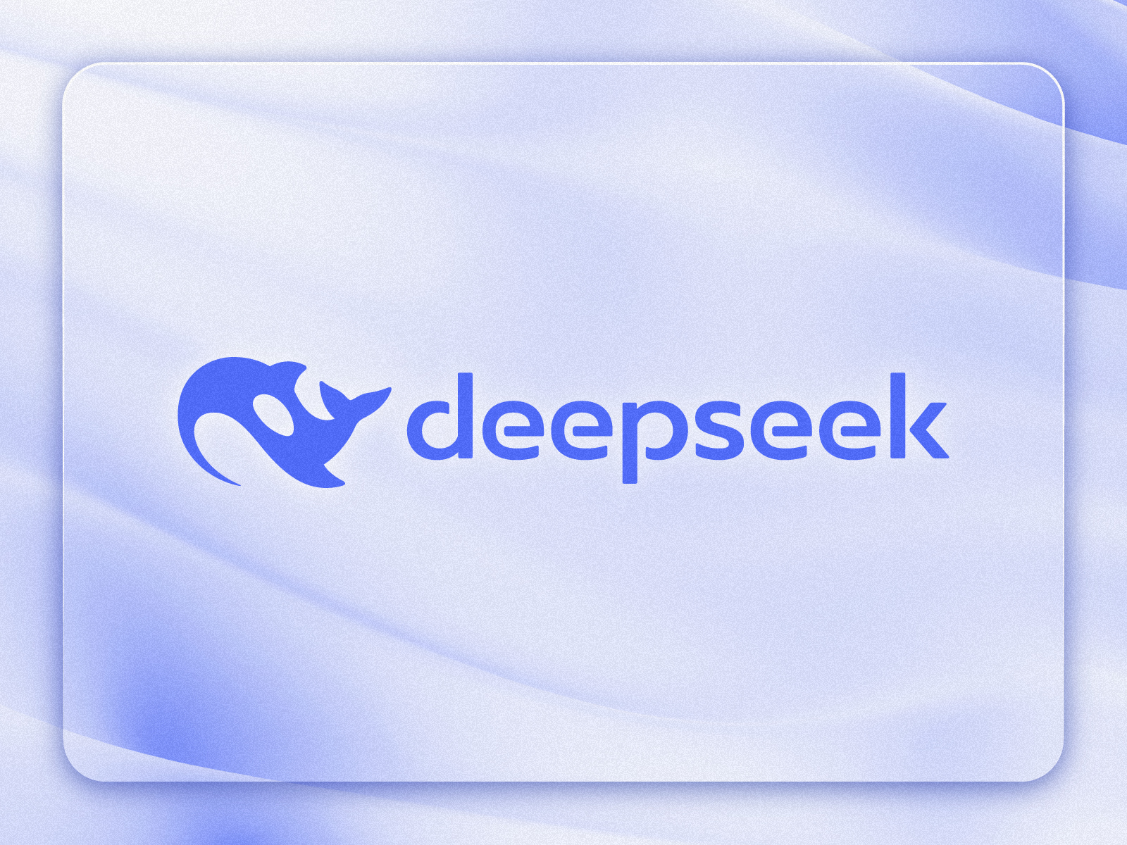
5. @Omeyimi Longe on Dribbble
This logo redesign makes the backside into one color, simplifying the details for easier application.
6. @inbranditdesign on X
Imtiaz Hossain Naim's redesign places a larger emphasis on the mouth, increasing the memorability of the logo while still retaining the friendliness of the rounded icon.
7. @scofieldmon on X
This is a super cute pixelated take on the Deepseek whale.

8. @5imc on X
This logo redesigned retained a lot of the original features, but simplified some details in the eyes and stomach of the whale. The dynamicsm is improved while keeping the original vibes, making this a great approach.
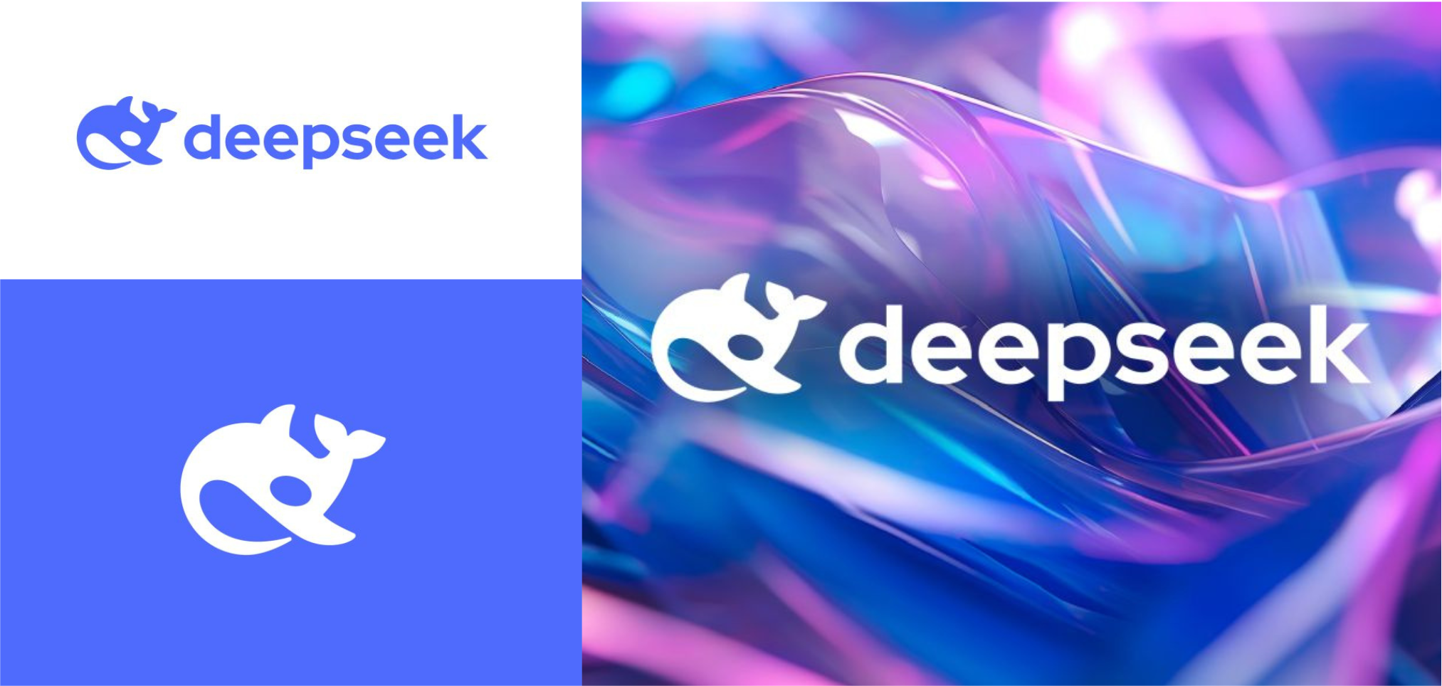
9. @kreatankon on Instagram
Designer Daniel Bodea believed that it was vital to resolve whether the icon was an orca or a humpback whale. He also had qualms about the smallness of the eyes and outdated font. Thus, his redesign redefines the shape as a recognizable orca and cleans up excess lines. He also chooses a new, more modern font to complement the new updated logomark.
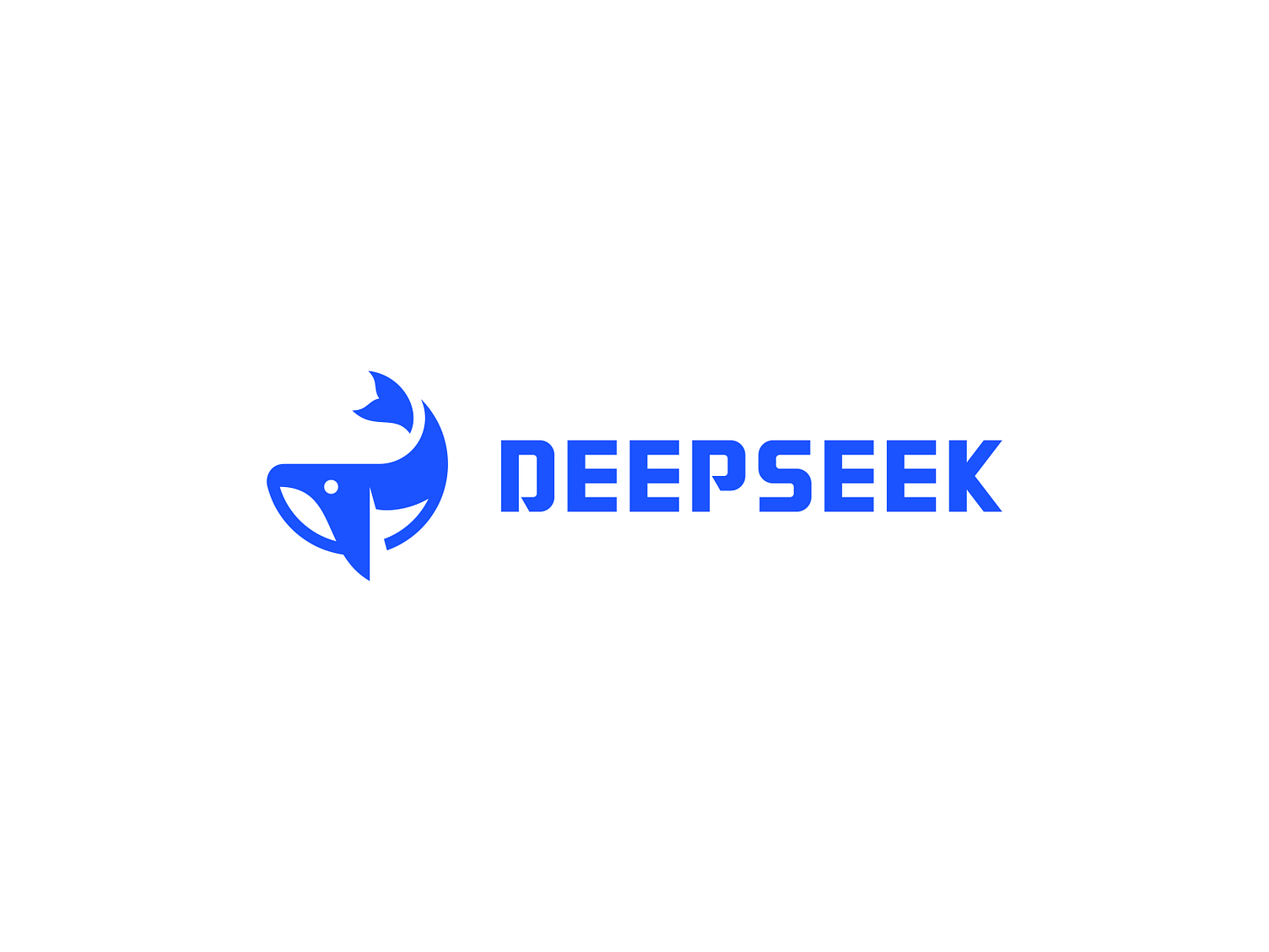
10. @logohype_ on Threads
This approach retains the original whale tail, morphing it into the letter “D”. This removal of the whole whale simplifies the icon while retaining the essence of the graphic. The font of the text is also altered to "Inter", improving the readability and UI compatibility.
Wrap Up
It’s truly inspiring to see how designers from around the world have brought their unique perspectives and creativity to reimagining the Deepseek logo. Each redesign proposal reflects the diverse ways people interpret Deepseek's brand identity and values. Whether you’re a fan of bold, modern aesthetics or subtle, symbolic touches, one thing is clear: Deepseek’s impact continues to inspire creativity across borders. Which design is your personal favorite?
If you would also like to try your hand at designing (or redesigning) the logo, head over to edit LogoAI's take on the Deepseek logo. To create your own logo from scratch, head on over to our logo maker to create your very own logo, powered by AI tools.