
A gradient logo incorporates a gradient or a transition from one color to another. This logo format can add visual interest and depth to a design and represent a sense of progression or growth.
One reason for the popularity of gradient logos is the widespread use of flat design in modern graphic design. Flat design is a minimalist logo approach that uses simple, solid colors and clean lines to create a sleek and contemporary look. By adding a gradient to a flat design, designers can create a more visually exciting and dynamic logo while maintaining the simplicity and cleanliness of the flat design aesthetic.
This essential guide will cover the basics of gradient logo design, including graphic design concepts, examples, and references.
What is a gradient?
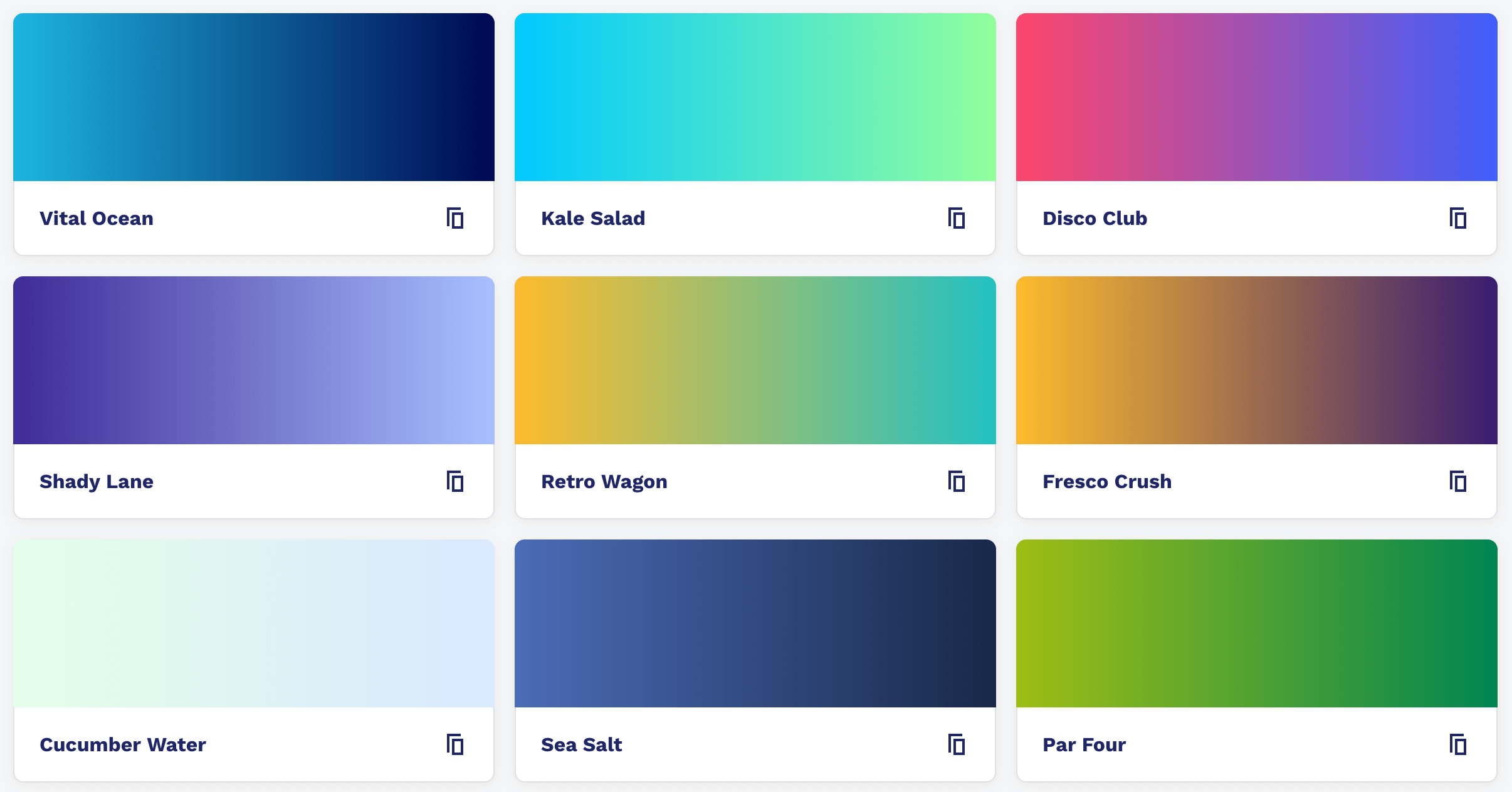 Credit: CSS Gradient Swatches.
"Gradient" is a term that comes from mathematics and refers to the gradual increase or decrease in the value of any given quantity.
In graphic design, a gradient is a gradual transition from one color to another. And in modern design, gradient applications add visual interest and depth. Gradients can go on par with shapes, text, and other design elements and facilitate various ways to create different effects.
In most design software, you'd find two main types of gradients: linear and radial. A linear gradient transitions from one color to another in a straight line, while a radial gradient transitions from one color to another in a circular or elliptical pattern.
Gradients can be monochromatic also. This means gradients transition from one shade of a single color to another, or they can be polychromatic, which means they transition from one color to another. And the result is an eye-catching visual that adds depth, texture, and interest to your design.
Should you choose a gradient logo for your business?
Whether or not a gradient logo is suitable for your business depends on several factors, including the nature of your business, the intended use of the logo, and your brand's overall aesthetic.
One reason to choose a gradient logo is that it can add visual interest and depth to a design. A gradient color identity creates a sense of movement or progression that represents the growth or evolution of a business. A gradient logo can also be an excellent way to stand out from competitors, as it can be a unique and eye-catching element in a crowded market.
However, there are also some potential drawbacks to choosing a gradient logo. For example, gradients can be difficult to reproduce accurately on certain materials, such as signage or embroidered clothing. In addition, gradients can sometimes make text challenging to read, mainly if the gradient is applied. A more straightforward, solid-color logo may be more effective in these cases.
Ultimately, choosing a gradient logo for your business should be based on your specific needs and goals. And in the modern setting, a gradient logo will help differentiate your business from others.
Gradient logo design examples
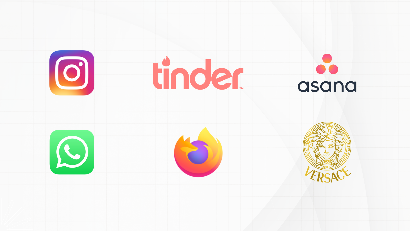
 gradient logo examples. The trend of incorporating a gradient effect in logos is booming. And this trend makes sense with the rise of mobile devices and high-resolution displays. Many corporate giants, including Meta, Firefox, Apple, General Motors, etc., have already adapted gradient logos.
Some tips for designing a gradient logo
By following these tips, you can create a gradient logo that is visually appealing and effective in communicating your brand message.
Choose the right gradient tool: Most graphic design programs have gradient tools that you can use to create a gradient logo. Make sure you understand how to use the gradient tools in your chosen program, and experiment with different settings and options to find the best gradient for your design. If you need an AI-powered gradient logo maker, try logoai.com.
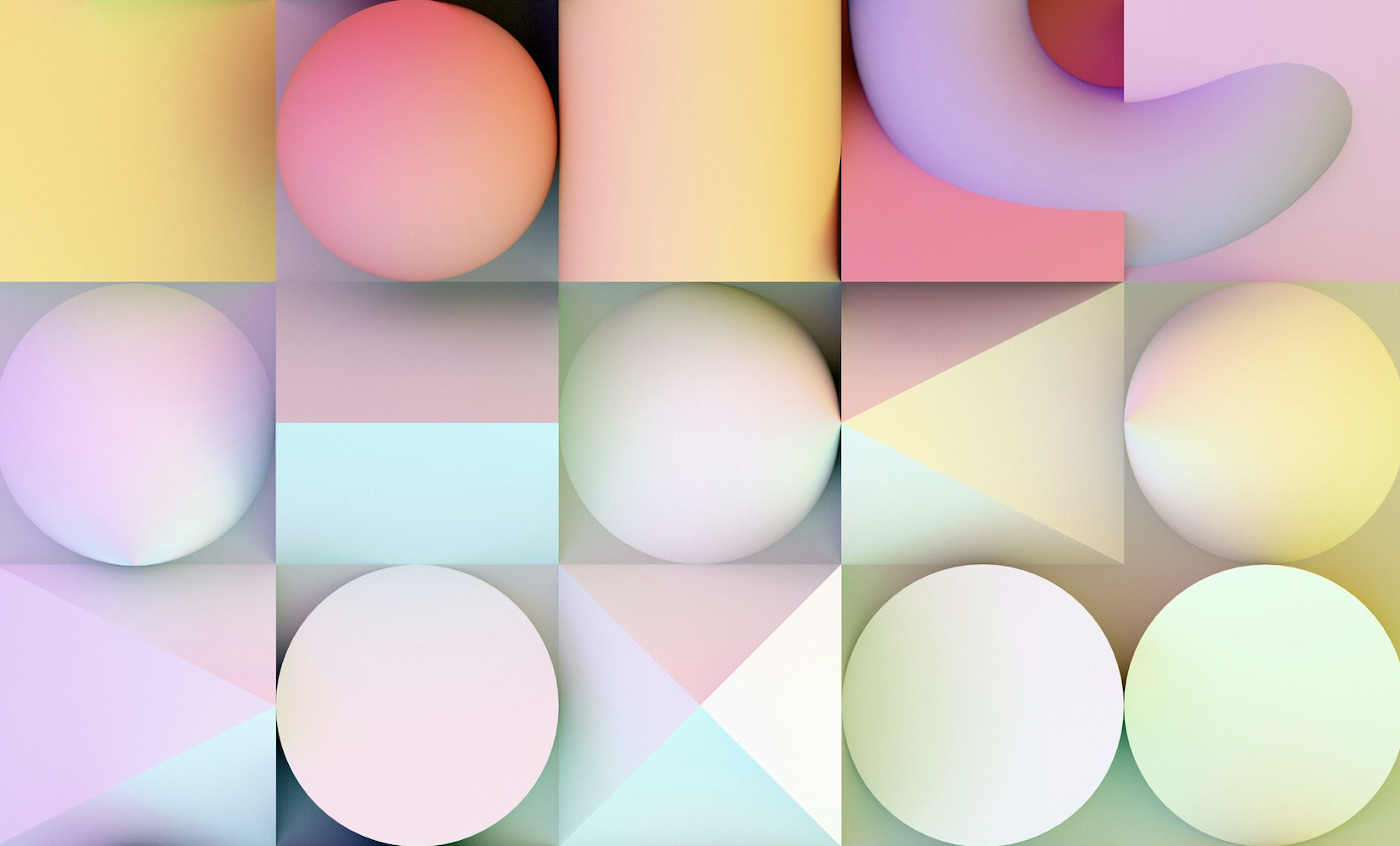
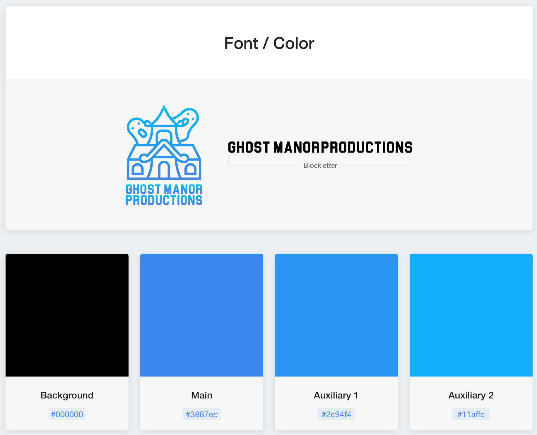 A gradient logo's font and color theme generated by logoai.com
Select the right colors: The colors you choose for your gradient logo will significantly impact the overall look and feel of the design. Consider the color scheme of your brand, and choose colors that complement each other and reflect the tone and personality of your business.
Adjust the direction and intensity: The gradient's direction and intensity affect the design's overall look and feel. Experiment with different settings to find the proper gradient for your logo.
Please keep it simple: A gradient logo should complement your design's other elements and not overpower your brand's overall aesthetic. Avoid using too many colors or too much gradation in your logo. Complex gradients can make the design difficult to comprehend.
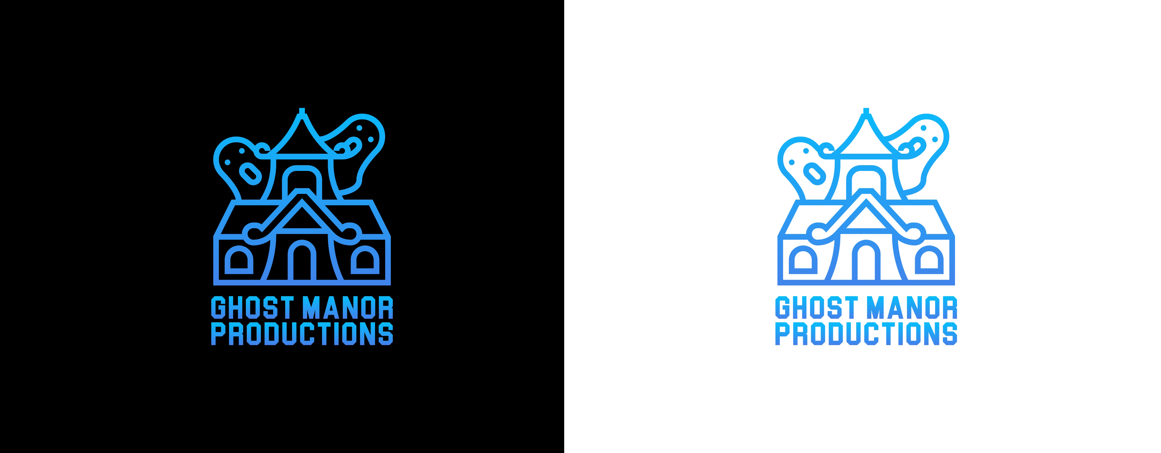 A gradient logo set in dark and light backgrounds respectively. Generated with logoai.com.
Test the logo in different contexts and backgrounds: Before finalizing your gradient logo, test it in other contexts, such as on your website, social media, or marketing materials. Also, ensure your gradient logo works well in dark and light backgrounds. This will help you ensure that the gradient is legible and effectively communicates your brand message.
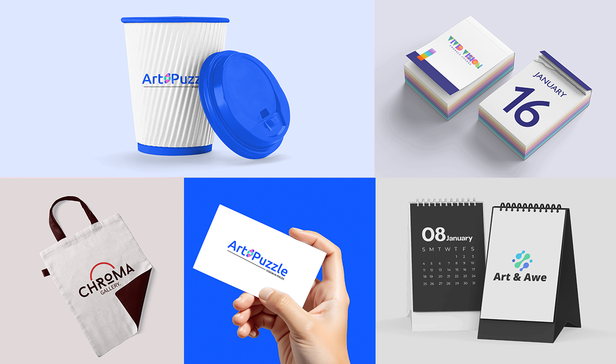
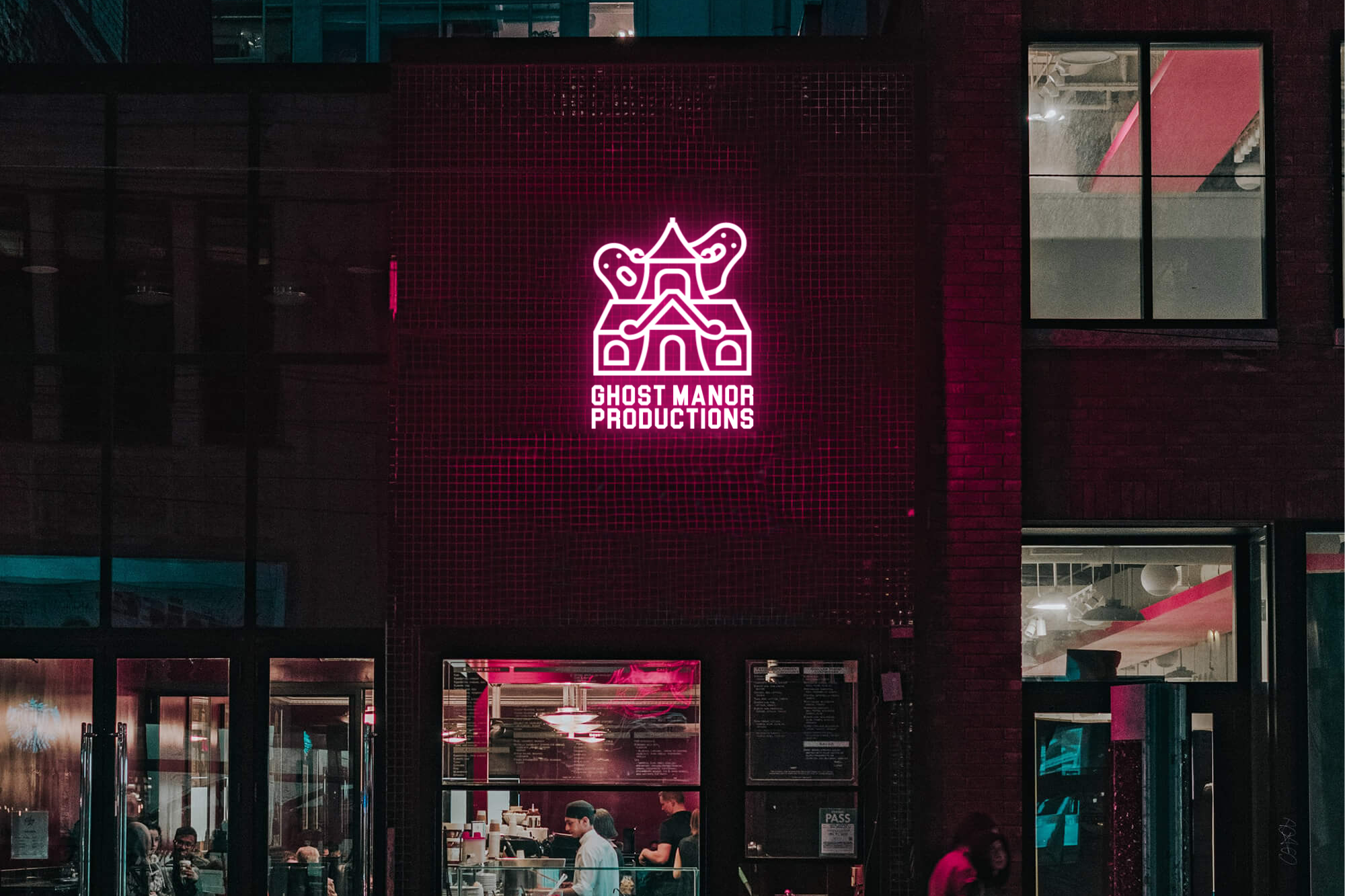 A logo mock up generated with logoai.com.
Free AI gradient logo maker and playground
LogoAI offers a free AI logo maker to generate gradient logos. To create a gradient logo with logoAI, you will need to follow these steps:
- Go to the logoAI logo maker website and click on the "Create a logo" button.
- Enter your business name and choose the industry that your business is in. You can also select a gradient color scheme and other design preferences, including icons to help logoAI generate a logo that matches your brand's aesthetic.
- Once you have entered your information, logoAI will generate a selection of logo designs for you to choose from.
- Browse the generated logos and select the one that you like best. You can customize the selected logo by changing the colors, fonts, and other design elements to create a unique logo that matches your brand.
- When satisfied with your gradient logo, you can purchase it and download it in the format of your choice.
Conclusion
Gradient logos have become a popular trend in graphic design due to their ability to add visual interest and dimension to a design. With the rise of the gritty gradient and texture trend, we can expect to see more brands adapting gradient logos. And if you believe your business's visual identity resonates with this trend, try LogoAI's gradient logo maker to create stunning logos.


-1741076768.png)