A strong and versatile logo is the foundation of a memorable brand identity, but no single design fits all situations. This is where logo variations come in handy. Logo variations are the alternate versions of the primary logo and easily align with the diverse range of platforms, materials and contexts – to maintaining a quality and consistent brand identity. Such variations, for instance a horizontal one for a website header or an icon for social media profile, are all important in today's branding.
What is a Logo Variation?
A logo variation can also be termed as an adapted version of your primary logo which is from time to time used on different branding functions. Most of the time, your primary logo earns credit for being the representative of the brand but that isn’t the case in all instances. As an example, a complex logo may be well suited for a website header but when it is reduced in size for a social media profile, it might lose its clarity.
Logo variations overcome this obstacle by providing options. Each of these various designs maintains the character of the brand while intended for a particular medium, such as business cards, product packaging, or websites.So you should have all these variations of logos:
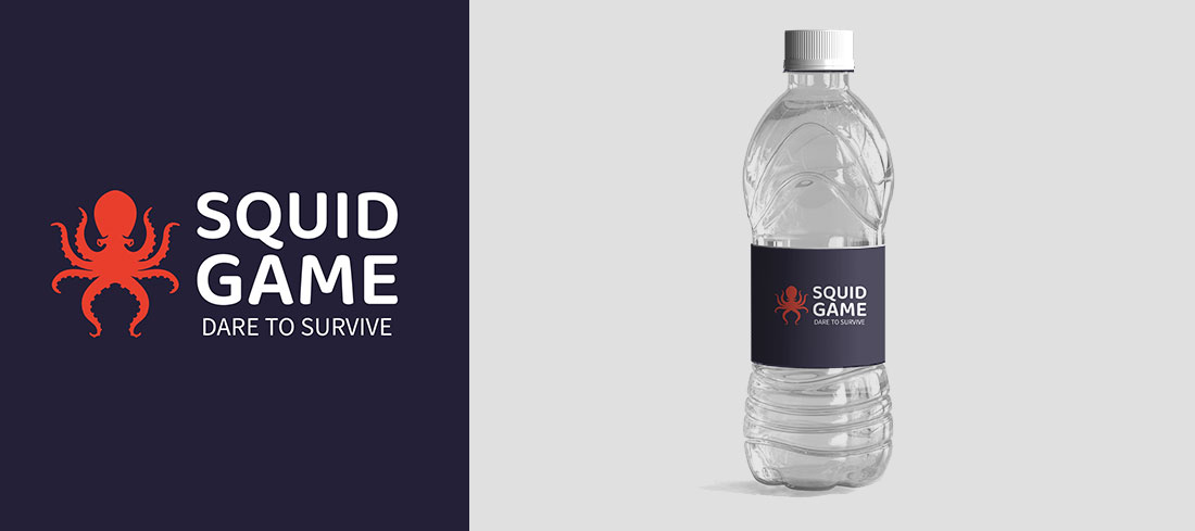
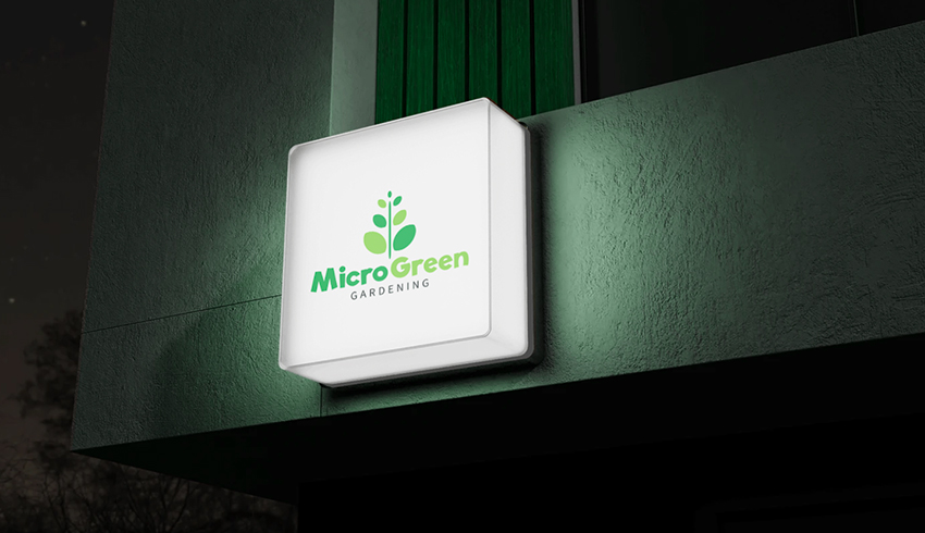
- Horizontal
- Vertical or “Stacked”
- Icon-based “Brandmark”
- Wordmark “Logotype”
- One-Color and Inverted

Why Logo Variations Matter for Your Brand
A one-size-fits-all logo may not always look its best or work effectively in every context. Here's why having logo variations is critical for your brand:
- Consistency Across Platforms: Logo variations assist with your branding objectives for each and every aspect – be it social media, websites, packaging, or promotional materials. This reinforces trust and allows your brand to be easily identifiable at any one time.
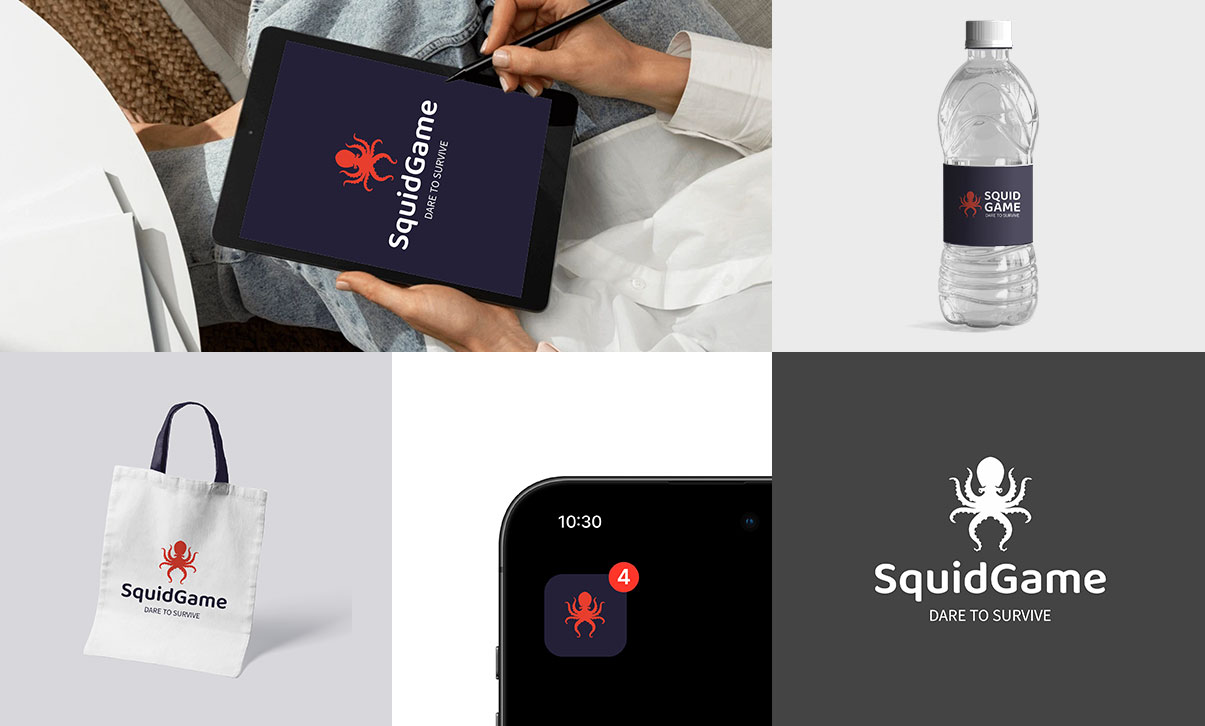
- Enhanced Versatility: Different placements call for different designs. For instance: Using a horizontal logo on a website header is ideal because it fits snugly there. Using an icon-based logo works well as one of the various app icons as well as social media profiles.
- Improved Usability: Some variations like one-color or inverted logos will ensure that the brand is still eye-catching even in situations of poor printing or in monochrome format.
- Targeted Communication: With different variations, you can put the focus on different elements of your brand. For example, your business name can be accentuated with a wordmark, while an icon focuses more on the graphic aspect of your identity.
Types of Logo Variations
Here are some key types of logo variations in order to increase the opportunity of your brand recognition and consistency.1. Horizontal
2. Vertical or Stacked
A vertical or stacked logo, also called a secondary logo, is a simplified, vertically arranged version of your primary logo. It's designed to work in spaces where the full primary logo doesn't fit well due to size or layout constraints. This variation ensures your brand stays visually consistent and adaptable across various platforms and formats.
3. Icon-based or Brandmark
Icons are effective elements for branding. Its study shows that these simple shapes represent a brand's personality and can sometimes dominate the recognition even more than the company's trademark. Such as:
- Favicons — Favicons that are associated with your website and appear on the tabs of the web browser, which is quite useful as it helps a potential customer to locate your site quickly.
- Social Media Avatars — If simplicity and professionalism are your goals across multiple platforms, using icons for profile images is your best option.
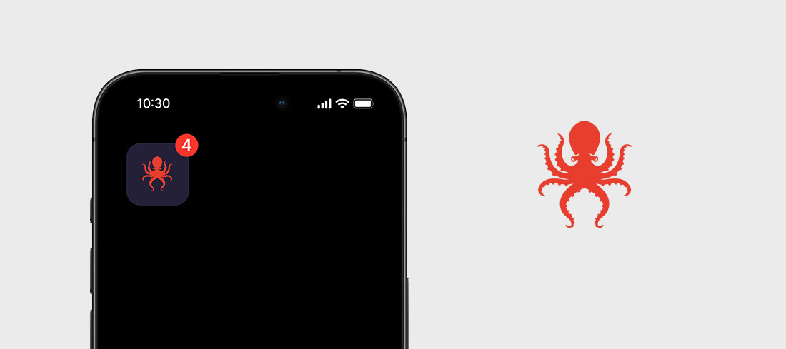
- App Logos —If you’re looking for an image to suit the brand’s internal domains such as app interfaces, App logo may be an excellent fit.
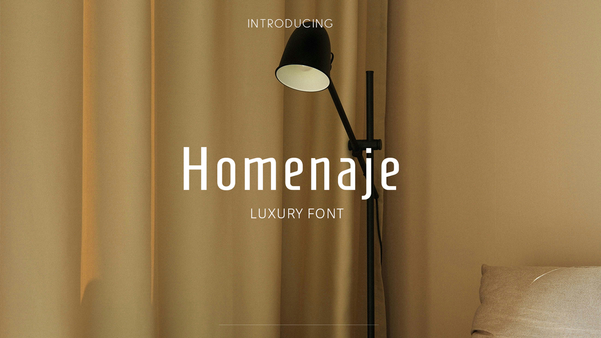
4. Wordmark
If your logo symbol itself already serve as a strong brand identifier similarly to the way Apple has its apple icon, you might not need to use a wordmark logo. However, a wordmark can still be useful in some cases, such as on official documents or where clarity is needed, but once your brand becomes widely recognized, the symbol alone may suffice in most situations.
If your have a text-only wordmark logo design, the logo variations will be focus on different treatments of the typography and color to fit various contexts.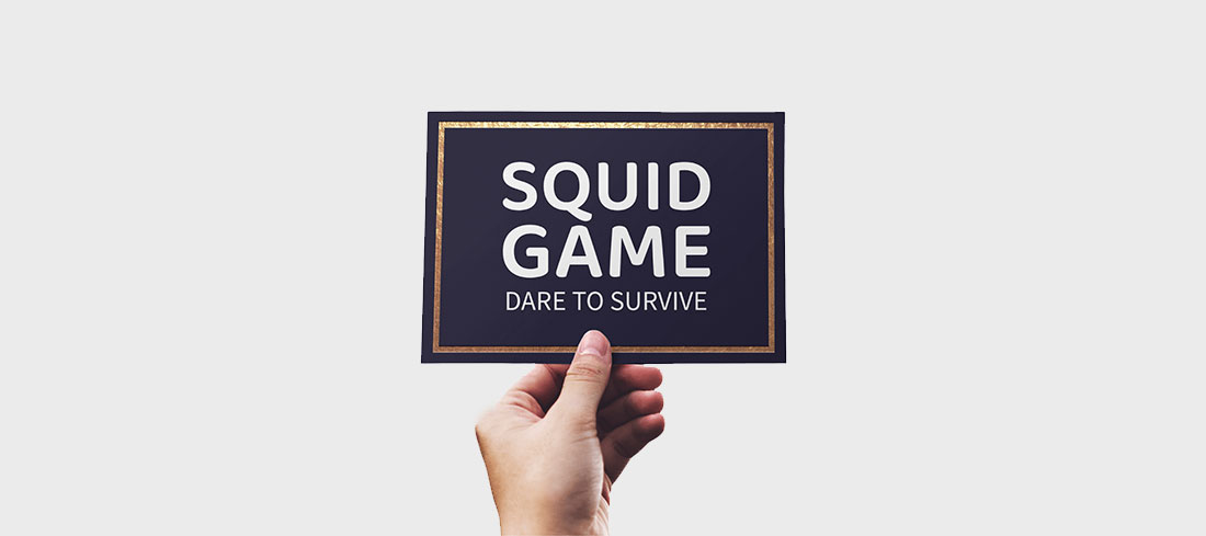
5. One color and Inverted Color
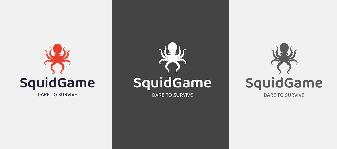
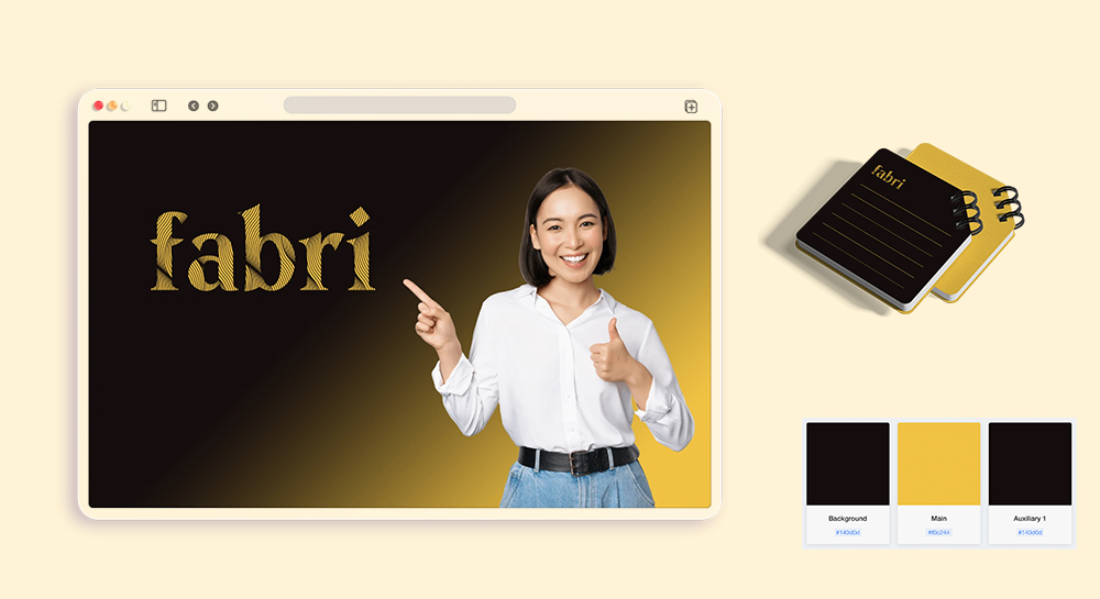
A one-color logo only uses one color, typically black or white and seldom mixes two colors in it. This avoids the challenge of dealing with contrast making it suitable for a range of background and easy to reproduce in black and white. One-color logos are very direct and easy to recall and this is why many famous global brands for instance Nike, Intel, Canon apply this kind of logos as they are very clear and practical.
An inverted logo color is important for flexibility and adaptability in your logo design. It makes your logo distinct on both dark and light surfaces. For instance, a dark-colored logo has its light/silver inverted version which can be used on dark surfaces, and the same is true for a light-colored logo as well.
Download logo variations from LogoAI's Download Center
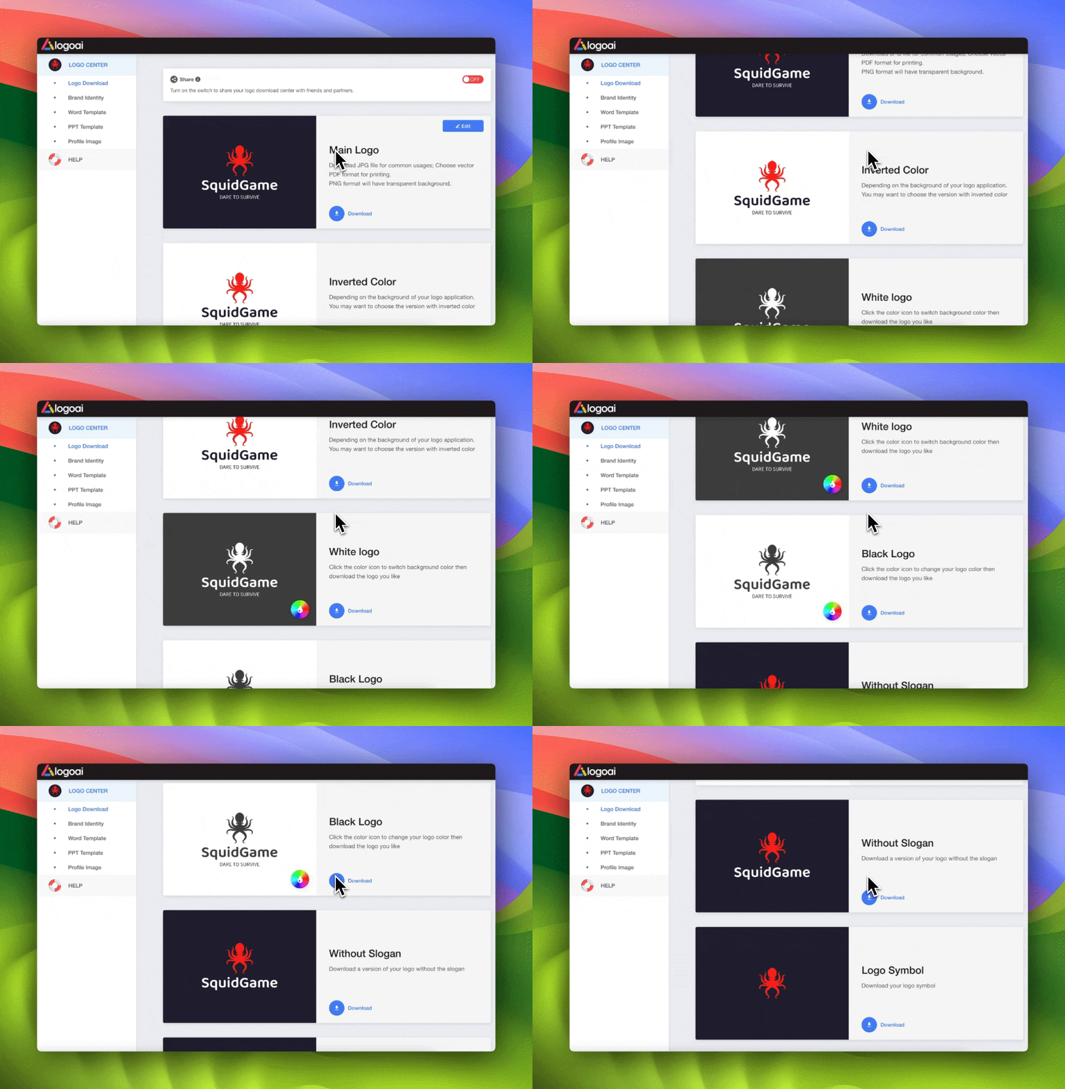
Once you're satisfied with your logo design and you've made your purchase, you'll gain access to a wealth of logo resources in the logo center. These include variations in main logo color, inverted color, black, and white, as well as versions with or without slogans and symbols. Each variation is available in PNG, JPG, PDF, and SVG formats, ensuring your branding needs are fully covered.
